MENU
Margin, Border, Padding
{margin | padding}[-top|-right|-bottom|-left]
:20px: reserves 20px for the margin or padding
:10% 30px: reserves 10% vertically and 30px horizontally for the margin or padding
:10% 20px 30px: 10% at the top, 20px at the sides, 30px at the bottom
:10px 20px 30px 40px: 10% at the top, 20px at right, 30px at the bottom, 40px at the left
:auto: centralizes
{margin|padding}[-block | -block-start | -block-end | -inline | -inline-start | -inline-end]
(sets the margin/padding start/end, depending on the writing mode, directionality, and text orientation)
outline[-color| -style| -width | -offset]
(displays a line outside the border on the margin)
RESETRUNFULL
<!DOCTYPE html><html><head><style>
h1,h2{
   margin: 20px;
   outline-offset: 15px;
}
h1{
   outline: groove brown 8px;
}
h2{
   outline: ridge green 8px;
}
h3{
   outline: inset orange 8px;
   border-width: 4px;
   border-color:black;
   border-style: dashed dotted double;
   float:left;
}
</style></head><body>
   <h1>Margin Collapse happens only between adjacent bottom and top margins.</h1>
   <h2>The resulting margin is the larger of the two values.</h2>
   <h3>The margins of floating and absolutely positioned elements never collapse.</h3>
</body></html>
border
[-top | -right | -bottom | -left | -block | -block-start | -block-end | -inline | -inline-start | -inline-end]
[-color | -style | -width]
(sets the border, depending on the writing mode, directionality, and text orientation)
...-color
:red: draws a red line on all four borders
:red green: red top and bottom, green left and right
:red green blue: red top, green left and right, blue bottom
:red green blue black: red top, green right, blue bottom, black left.
...-style
:none
:hidden
:dotted
:dashed
:solid
:double
:groove: into the page.
:ridge: out of the page.
:inset
:outset
:dotted dashed solid double: different borders at different sides.
...-width
:thin: a thin line
:medium: a medium line
:thick: a thick line
:30px: a line that is 30px thick
:10px 20px 30px: 10px at the top, 20px at the right and left, 30px at the bottom.
RESETRUNFULL
<!DOCTYPE html><html><head><style>
p{
   border:0;
   border-bottom:1px solid black;
   width:fit-content;
}
input{
   border:0;
   border-bottom:1px solid black;
   font-size:50px;
   width:2ch;
   padding-left:1ch;
}
</style></head><body>
   <p contenteditable>Alex Mac</p>
   <form>
      <input name="d1" type="number" max="9" oninput="d2.focus(); d2.value=null;"/>
      <input name="d2" type="number" max="9" oninput="d3.focus(); d3.value=null;"/>
      <input name="d3" type="number" max="9" oninput="d4.focus(); d4.value=null;"/>
      <input name="d4" type="number" max="9" oninput="d1.focus(); d1.value=null;"/>
   </form>
</body></html>RESETRUNFULL
<!DOCTYPE html><html><head><style type="text/css">
   img, div, a{
      display: inline-block;
   }
   img {
      width: calc(20% - 170px);
      height: auto;
   }
   #triangle {
      width: 0;
      height: 0;
      border-left: 50px solid transparent;
      border-right: 50px solid transparent;
      border-bottom: 100px solid red;
   }
   #circle {
      width: 100px;
      height: 100px;
      border-radius: 50px;
      border: 2px solid;
      background: url('/shared/interchain.jpg');
   }
</style></head><body>
   <img src="/shared/leaves.jpg"/>
   <div id="triangle"></div>
   <a href="http://google.com"><div id="circle"></div></a>
</body></html>
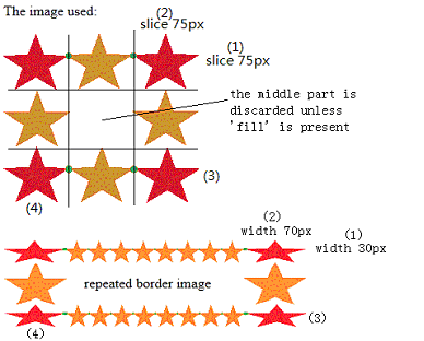
border-image {source} {slice} / [width] [outset] [repeat];
(all-in-one declaration)
...border-image-source
:"url(a.gif)": uses a.gif as the border
...border-image-slice (1 to 4 values)
:75: slices 75px from the edge
:30%: slices 30% from the edge
...border-image-width (1 to 4 values)
:75px 50px 30px: sets the top width to be 75px, the right and left widths to be 50px, and the bottom width to be 30px
:10%:sets the width to be 10% of the image area
:auto: uses the value of the image slice
...border-image-outset (1 to 4 values)
:10px: the image extends 10px beyond the border
:5: the image extends beyond 5 times the width
...border-image-repeat (1 to 2 values)
:stretch: the image is stretched.
:repeat: the image is repeated, possibly clipped.
:round: the image is repeated and scaled to fit a whole number.
:space: the image is repeated, space evenly distributed.
:stretch repeat: 'stretch' top and bottom, 'repeat' left and right.
RESETRUNFULL
<!DOCTYPE html><html><head><style type="text/css">
    div{
      border:15px solid;
      width:160px;
      padding:10px 20px;
   }
   #round{
      border-image:url("/shared/border-image.gif")
       75 75 / 30px 70px round;
   }
   #stretch{
      border-image:url("/shared/border-image.gif")
       75 / 30px stretch;
   }
</style></head><body>
   <p>The image used:</p>
   <img src="/shared/border-image.gif" /><br /><br /><br />
   <div id="round">repeated border image</div><br />
   <div id="stretch">stretched border image</div>
</body></html>