CSS transitions and @keyframes animate SVG's presentation properties like any others, with two SVG rules. A transform's origin is the viewport's corner unless you set transform-box: fill-box and transform-origin: center. And line drawing is a dash trick: with pathLength="1" a dash of 1 spans the path, so animating stroke-dashoffset from 1 to 0 draws it. The Web Animations API (element.animate(), Baseline since 2020) runs the same keyframes from script as an Animation you can pause, seek or await.
<style>
  svg { margin-right:10px; font:12px Arial }
  .nest { fill:none; stroke:#263238; stroke-width:4; stroke-dasharray:1; stroke-dashoffset:1 }
  .star { fill:#e09a10; transform-box:fill-box; transform-origin:center }
</style>
<svg id="frame" width="130" height="110" viewBox="0 0 130 110">
  <path class="nest" pathLength="1" d="M10 50Q65 72 120 50Q115 95 65 96Q15 95 10 50Z"/>
  <path class="star" d="M65 8 71 24 88 25 75 35 79 51 65 42 51 51 55 35 42 25 59 24Z"/>
  <text x="65" y="108" text-anchor="middle"></text>
</svg>
<script>
  const first = frame;
  for (const ms of [0, 250, 500, 1000]) {
    const svg = ms ? document.body.appendChild(first.cloneNode(true)) : first;
    svg.querySelector('text').textContent = `${ms} ms`;
    const timing = { duration: 1000, easing: 'ease-in-out', fill: 'forwards' };
    const anims = [
      svg.querySelector('.nest').animate({ strokeDashoffset: [1, 0] }, timing),
      svg.querySelector('.star').animate(
        { transform: ['scale(.2) rotate(-180deg)', 'none'], opacity: [0, 1] }, timing)];
    for (const a of anims) { a.pause(); a.currentTime = ms; }
  }
</script>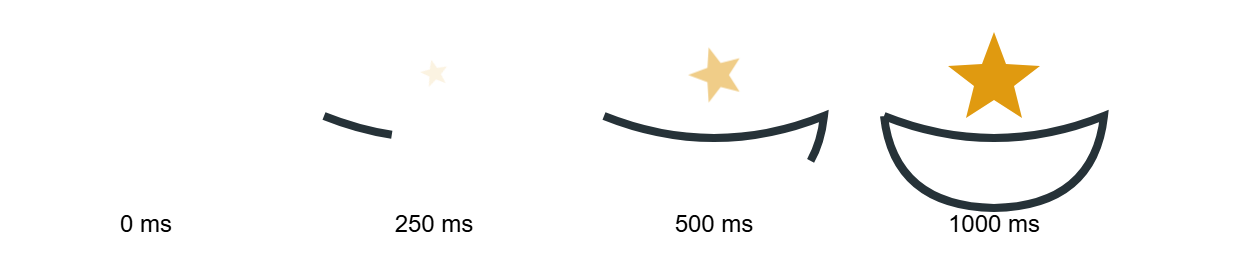
Seeking a paused animation is how you build scrubbers and test frames; on a live page, drop pause() and await anims[0].finished. The same keyframes work as CSS @keyframes; the API adds control.