A <linearGradient> runs from (x1,y1) to (x2,y2), by default left to right across the shape's bounding box, where 0 and 1 mean its edges (gradientUnits="objectBoundingBox"); userSpaceOnUse switches to canvas coordinates so one gradient spans many shapes. Child <stop>s set offset, stop-color and stop-opacity. spreadMethod says what lies beyond the ends: pad repeats the end colors, reflect mirrors, repeat restarts. A <radialGradient> runs from a focal point (fx,fy) out to the circle (cx,cy,r). A gradient can href another to inherit its stops and attributes, and gradientTransform rotates or skews it.
<svg width="600" height="120">
  <linearGradient id="dusk" x2="0" y2="1"><stop offset="0" stop-color="#1f5f8b"/>
    <stop offset="0.6" stop-color="#5b3f99"/><stop offset="1" stop-color="#e09a10"/>
  </linearGradient>
  <linearGradient id="pad" x2="0.25"><stop offset="0" stop-color="#3f7d3a"/>
    <stop offset="1" stop-color="#fff3e0"/></linearGradient>
  <linearGradient id="reflect" href="#pad" spreadMethod="reflect"/>
  <linearGradient id="repeat" href="#pad" spreadMethod="repeat"/>
  <radialGradient id="ball" fx="0.35" fy="0.3"><stop offset="0" stop-color="#fff"/>
    <stop offset="1" stop-color="#b5452f"/></radialGradient>
  <rect x="10" y="5" width="80" height="110" rx="4" fill="url(#dusk)"/>
  <rect x="120" y="5" width="300" height="30" fill="url(#pad)"/>
  <rect x="120" y="45" width="300" height="30" fill="url(#reflect)"/>
  <rect x="120" y="85" width="300" height="30" fill="url(#repeat)"/>
  <circle cx="510" cy="60" r="55" fill="url(#ball)"/>
</svg>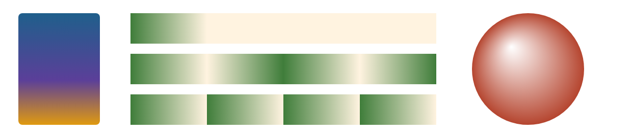
The three bars share one ramp over the first quarter of their width: pad holds the cream to the end, reflect bounces back and forth, repeat saws. Moving the radial focal point up and left turns a flat disc into a lit sphere, the cheapest 3D effect in SVG. Gradients need no <defs> wrapper; they never render on their own.