These utilities cover the painting properties of Graphic Properties and Radius, Shadow and Wrapping: backgrounds and gradients, borders, outlines, radius, shadows, opacity, blending and masking. Color utilities all accept the palette and opacity modifiers from Colors, so bg-sky-500/20, border-black/10 and shadow-indigo-500/40 need no extra configuration.
| Utility | CSS |
|---|---|
| bg-white, bg-sky-500/20, bg-[#0b1020] | background-color |
| bg-linear-to-r, bg-linear-45, bg-radial, bg-conic-90 | linear-gradient(to right, ...), 45deg in oklab, radial, conic |
| from-sky-500, via-indigo-500 via-30%, to-pink-500 | Gradient stops and their positions |
| bg-[url(/hero.jpg)], bg-none | background-image |
| bg-cover, bg-contain, bg-center, bg-no-repeat | background-size, -position, -repeat |
| bg-fixed, bg-clip-text, bg-origin-content | background-attachment, -clip: text, -origin |
| Utility | CSS |
|---|---|
| border, border-2, border-t-4, border-s | border-width: 1px, 2px; top 4px; inline start 1px |
| border-slate-200, border-dashed, border-none | border-color, border-style |
| divide-y, divide-slate-200 | Borders between children (& > :not(:last-child)) |
| rounded-sm, rounded-xl, rounded-full | border-radius: 0.25rem, 0.75rem, calc(infinity * 1px) |
| rounded-t-lg, rounded-s-lg, rounded-ee-lg | Two physical corners; logical start corners; one corner |
| outline-2, outline-offset-2, outline-sky-500 | outline-width, outline-offset, outline-color |
| outline-hidden | outline: 2px solid transparent (visible in forced colors) |
| ring-2, ring-sky-500, inset-ring | box-shadow: 0 0 0 2px ring in the ring color |
| Utility | CSS |
|---|---|
| shadow-xs, shadow-md, shadow-2xl | Layered box-shadow presets; shadow-2xl is 0 25px 50px -12px |
| shadow-sky-500/40, inset-shadow-sm | Shadow color; inset 0 2px 4px |
| text-shadow-sm, text-shadow-lg, text-shadow-sky-900/50 | text-shadow presets and color (v4.1+) |
| opacity-75, opacity-0 | opacity: 75%, 0% |
| mix-blend-multiply, bg-blend-overlay | mix-blend-mode, background-blend-mode |
| mask-b-from-50%, mask-x-from-80% | Fade an edge with a linear-gradient mask (v4.1+) |
| mask-radial-from-40%, mask-conic-from-25% | Radial or conic gradient masks |
| mask-[url(/logo.svg)], mask-contain, mask-no-repeat | mask-image, mask-size, mask-repeat |
Each gallery tile shows one technique: gradient text (bg-clip-text text-transparent), a dashed border inside an offset outline, a tinted shadow, shadowed text, two multiplied circles, and stripes faded by two stacked masks.
<script src="https://cdn.jsdelivr.net/npm/@tailwindcss/browser@4.3.3"></script>
<div class="grid grid-cols-3 gap-5 bg-slate-100 p-5 font-sans *:h-24 *:rounded-xl *:bg-white">
  <div class="grid place-items-center text-3xl font-black">
    <span class="bg-linear-to-r from-sky-500 via-indigo-500 to-pink-500 bg-clip-text
                 text-transparent">Gradient</span></div>
  <div class="border-2 border-dashed border-sky-400 outline-2 outline-offset-4
              outline-amber-400"></div>
  <div class="shadow-xl shadow-indigo-500/40"></div>
  <div class="grid place-items-center bg-sky-300! text-3xl font-black text-white
              text-shadow-lg text-shadow-sky-900/50">Shadow</div>
  <div class="relative isolate">
    <div class="absolute top-3 left-10 size-18 rounded-full bg-rose-400 mix-blend-multiply"></div>
    <div class="absolute top-3 left-22 size-18 rounded-full bg-sky-400 mix-blend-multiply"></div>
  </div>
  <div class="bg-[repeating-linear-gradient(45deg,#6366f1_0_10px,#f59e0b_10px_20px)]!
              mask-r-from-40% mask-b-from-60%"></div>
</div>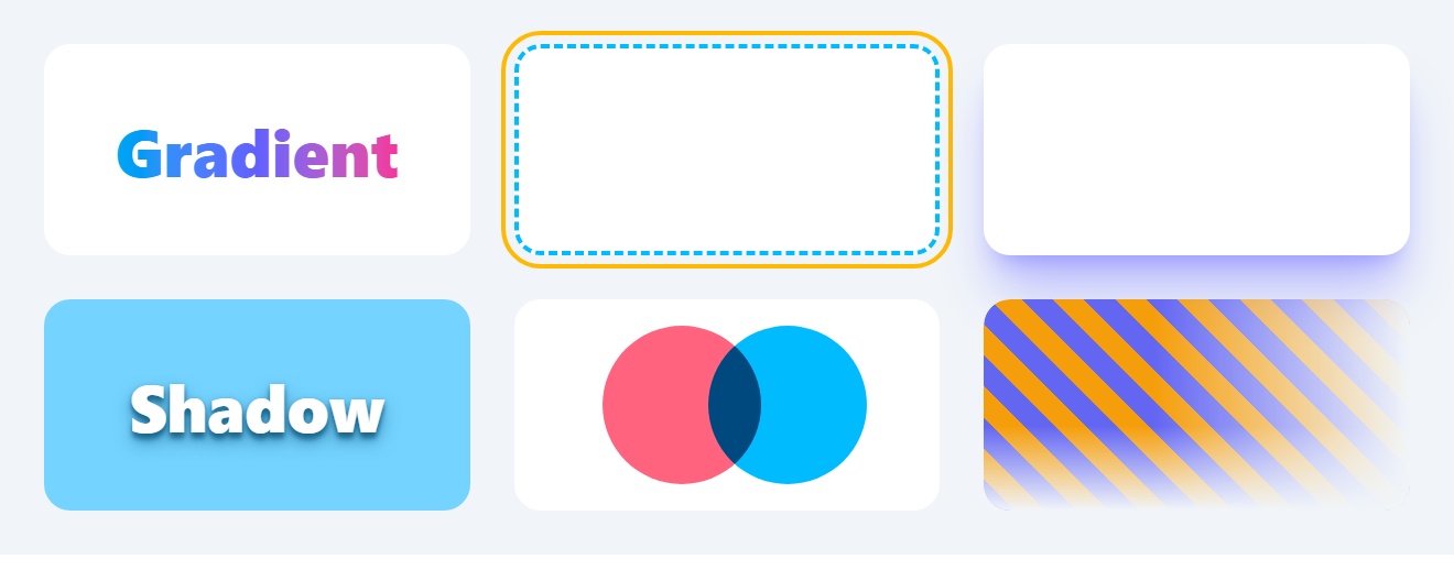
The ! suffix makes a tile's own background important so it beats the parent's shared *:bg-white. The circles tile relies on isolate (Object Fit, Float and Clear): without a new stacking context the circles would also multiply with whatever lies behind the card.
Practical notes:
Several names shifted in v4 so every scale has an xs step: v3 shadow-sm is now shadow-xs, bare shadow is shadow-sm, rounded is rounded-sm, outline-none is outline-hidden, and ring is 1px (use ring-3 for the old 3px). Upgrading from v3 to v4 lists the rest.
border and divide-* now default to currentColor, not gray-200, so always add a color class.
shadow-*, inset-shadow-*, ring-* and inset-ring-* write separate custom properties that are combined into one box-shadow, so a card can wear a shadow and a focus ring at the same time.
Prefer outline-* for focus indicators on controls: outlines do not affect layout and survive Windows high-contrast mode, where box shadows are removed (Interactivity and SVG).