The utilities in this section compose. Every filter class sets its own custom property (--tw-blur, --tw-sepia...) and a single filter declaration strings them all together, so blur-xs grayscale applies both functions instead of the second class overwriting the first. Transforms work the same way through the individual translate, rotate and scale properties, which is why hover:scale-105 can be added to an element that is already -rotate-2. The CSS is explained in Imaging (filters), 4.7.2 (tables), 4.8.8 (transforms) and 4.9 (transitions and animation).
| Utility | CSS |
|---|---|
| blur-xs, blur-sm, blur-lg | filter: blur(4px), 8px, 16px |
| brightness-125, contrast-150, saturate-50 | brightness(125%), contrast(150%), saturate(50%) |
| grayscale, sepia, invert, hue-rotate-90 | grayscale(100%), sepia(100%), invert(100%), hue-rotate(90deg) |
| drop-shadow-md, drop-shadow-sky-500/50 | drop-shadow(0 3px 3px ...) and its color |
| backdrop-blur-md, backdrop-brightness-75 | backdrop-filter: blur(12px), brightness(75%) |
Table styling needs only four utility families: border-collapse or border-separate with border-spacing-2, table-auto or table-fixed (table-layout), and caption-top or caption-bottom. Stripes and hover rows come from variants rather than special classes: odd:bg-slate-50 hover:bg-sky-50 on each <tr>.
| Utility | CSS |
|---|---|
| transition | Colors, opacity, shadow, transforms, filters, display...; 150ms |
| transition-colors, transition-opacity, transition-transform | A narrower transition-property list |
| transition-all, transition-discrete | all; transition-behavior: allow-discrete |
| duration-300, delay-150 | transition-duration: 300ms, transition-delay: 150ms |
| ease-in, ease-out, ease-in-out, ease-linear | Bezier presets and linear |
| animate-spin, animate-ping | spin 1s linear infinite; ping 1s ... infinite (scale to 2, fade out) |
| animate-pulse, animate-bounce, animate-none | Opacity pulse 2s; vertical bounce 1s; none |
| motion-safe:animate-spin, motion-reduce:transition-none | Wrap in prefers-reduced-motion queries |
| Utility | CSS |
|---|---|
| translate-x-4, -translate-y-1/2, translate-z-8 | translate: 1rem, -50% vertically, z offset |
| rotate-45, -rotate-3, rotate-x-50, rotate-y-30 | rotate: 45deg; transform: rotateX(50deg) ... |
| scale-110, scale-x-75, -scale-x-100 | scale: 110% 110%; x only; mirror |
| skew-x-12, origin-top-left | transform: skewX(12deg); transform-origin |
| perspective-near, perspective-distant | perspective: 300px, 1200px |
| transform-3d, backface-hidden | transform-style: preserve-3d, backface-visibility: hidden |
A screenshot cannot show motion, so the demo freezes each effect. The notification dot pauses animate-ping 30% into its cycle with two arbitrary properties, and the switch knob shows the end state of its transition-transform after a script flips it, as a click would.
<script src="https://cdn.jsdelivr.net/npm/@tailwindcss/browser@4.3.3"></script>
<div class="grid grid-cols-4 gap-4 bg-white p-5 font-sans text-sm">
  <div class="col-span-4 grid grid-cols-4 gap-4 *:h-20 *:rounded-lg *:bg-conic
              *:from-amber-300 *:via-rose-500 *:to-amber-300">
    <div></div><div class="grayscale"></div>
    <div class="hue-rotate-180"></div><div class="blur-xs"></div>
  </div>
  <div class="relative col-span-2 h-28 overflow-hidden rounded-lg bg-linear-45 from-sky-500
              to-violet-600">
    <b class="absolute top-6 left-8 text-5xl text-white">GLASS</b>
    <div class="absolute inset-y-4 right-4 left-24 rounded-lg bg-white/20 p-2 backdrop-blur-sm">
      backdrop-blur-sm</div>
  </div>
  <div class="perspective-near grid place-items-center">
    <div class="rotate-y-30 rotate-x-15 rounded-lg bg-indigo-500 p-5 text-white shadow-xl">3D</div>
  </div>
  <div class="flex flex-col items-center justify-center gap-5">
    <span class="relative flex size-4">
      <span class="absolute size-full animate-ping rounded-full bg-rose-400
                   [animation-delay:-300ms] [animation-play-state:paused]"></span>
      <span class="relative size-4 rounded-full bg-rose-500"></span></span>
    <button id="sw" class="h-6 w-11 rounded-full bg-emerald-500 p-0.5">
      <span class="block size-5 rounded-full bg-white transition-transform duration-300"></span>
    </button>
  </div>
</div>
<script>document.querySelector("#sw span").classList.add("translate-x-5");</script>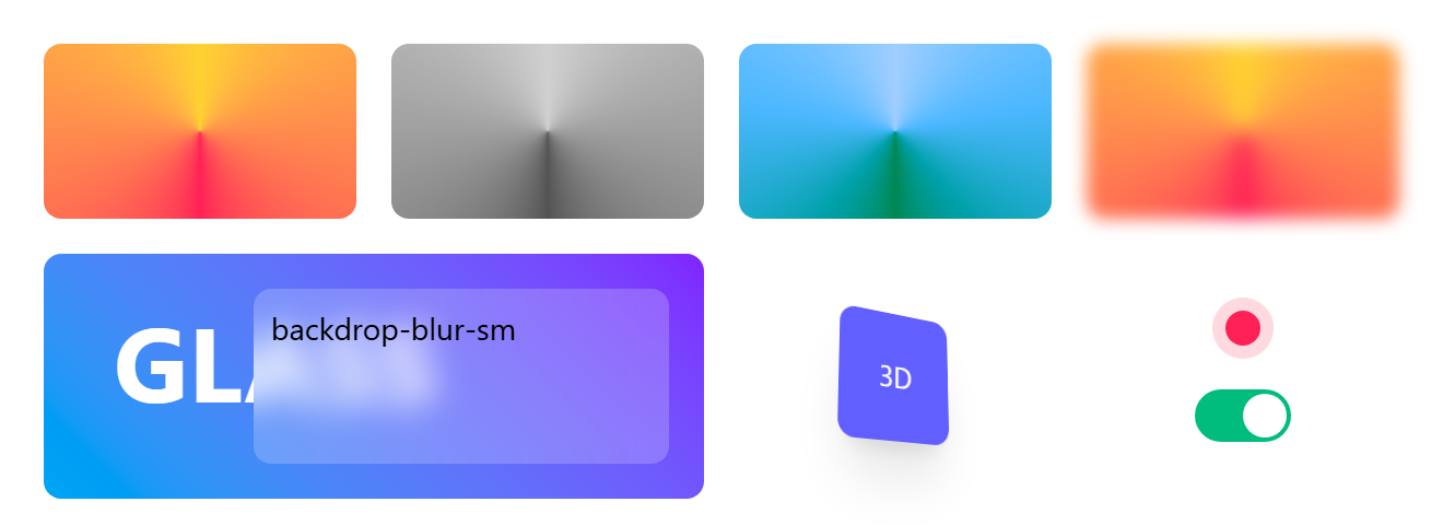
The first row applies no filter, grayscale, hue-rotate-180 and blur-xs to the same conic gradient. In the frosted panel, backdrop-blur-sm blurs whatever lies behind the translucent bg-white/20 layer, here the word GLASS, so the panel needs a translucent background. The card needs perspective-near on its parent before rotate-y-30 looks three-dimensional. Custom animations go in @theme as an --animate-wiggle variable plus its @keyframes block, which creates an animate-wiggle class (Theme Variables).