grid-cols-<n> defines n equal columns; col-span-*, col-start-* and row-span-* place items across the lines; grid-flow-* and auto-rows-* control the implicit grid that holds items you did not place.
| Utility | CSS |
|---|---|
| grid-cols-3 (grid-rows-3) | repeat(3, minmax(0, 1fr)) |
| grid-cols-[16rem_1fr], grid-cols-subgrid | 16rem 1fr, subgrid |
| col-span-2, col-span-full | grid-column: span 2 / span 2, 1 / -1 |
| col-start-2, col-end-4, -col-end-1 | grid-column-start: 2; -end: 4, -1 |
| row-span-2, row-start-1 | grid-row: span 2 / span 2; -start: 1 |
| grid-flow-col, grid-flow-row-dense | grid-auto-flow: column, row dense |
| auto-rows-fr, auto-cols-min, auto-rows-9 | minmax(0, 1fr), min-content, 2.25rem |
The dashboard shell below uses a four-column grid. The header spans every column, the sidebar three rows and the chart three columns, and grid-flow-row-dense lets the small cards fill the hole a wide card would otherwise leave.
<script src="https://cdn.jsdelivr.net/npm/@tailwindcss/browser@4.3.3"></script>
<div class="grid grid-flow-row-dense auto-rows-9 grid-cols-4 gap-2 p-4 font-sans text-sm
            text-white *:rounded *:p-2">
  <header class="col-span-full bg-slate-700">header: col-span-full</header>
  <nav class="row-span-3 bg-indigo-600">nav: row-span-3</nav>
  <div class="bg-sky-600">card 1</div>
  <div class="col-span-3 bg-emerald-600">chart: col-span-3 (placed after card 1)</div>
  <div class="bg-sky-600">card 2 (dense)</div>
  <div class="bg-sky-600">card 3 (dense)</div>
  <div class="col-span-2 bg-amber-500">table: col-span-2</div>
  <div class="bg-sky-600">card 4</div>
</div>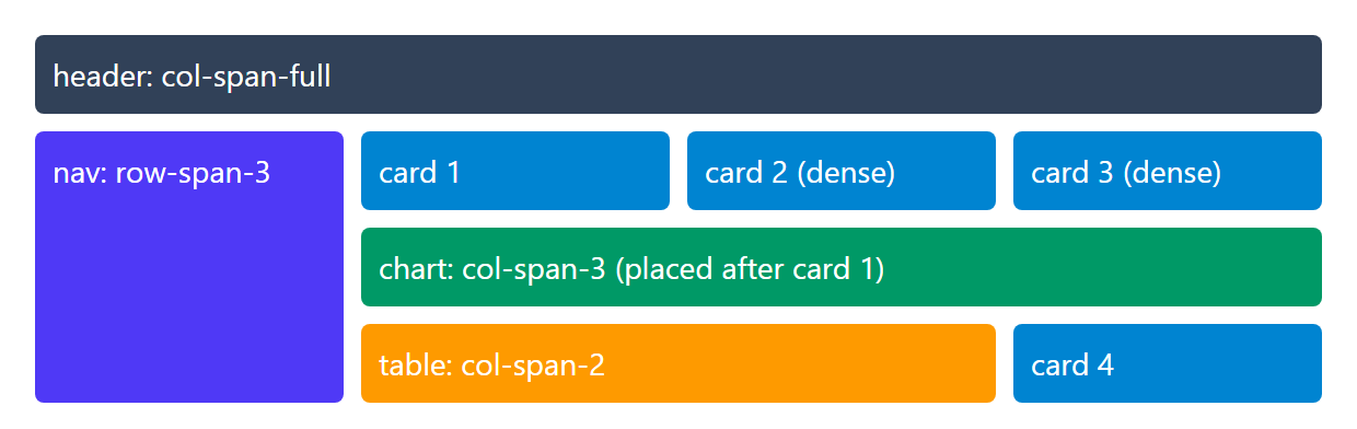
The chart does not fit beside card 1, so it drops a row; dense packing backfills the hole with cards 2 and 3. Visual order now differs from source order, so avoid dense for focusable content.