Responsive variants wrap a utility in a min-width media query: sm 40rem (640px), md 48rem, lg 64rem, xl 80rem and 2xl 96rem, so md:flex compiles to @media (width >= 48rem). The system is mobile-first: unprefixed classes apply at every width, and sm: means "from 640px up", not "on small screens".
<script src="https://cdn.jsdelivr.net/npm/@tailwindcss/browser@4"></script>
<div class="flex flex-col items-center gap-2 p-4 text-center sm:flex-row sm:text-left">
  <div class="size-16 shrink-0 rounded-full bg-linear-to-br from-sky-400 to-indigo-600"></div>
  <div>
    <p class="text-lg font-semibold">Erin Lindford</p>
    <button class="w-full rounded-full border px-4 py-1 text-purple-600 sm:w-auto">Message</button>
  </div>
  <p class="hidden rounded bg-amber-100 px-2 text-xs max-sm:block">max-sm: only below 640px</p>
</div>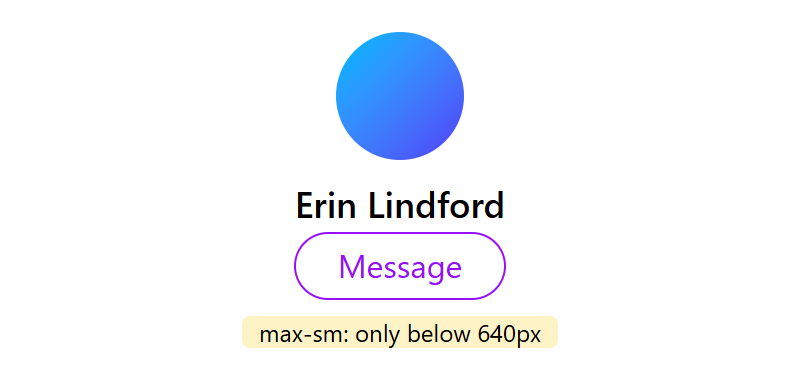
From 640px the card becomes a row and the hint disappears. max-* variants cap a range (md:max-lg:grid), min-[900px]: makes a one-off breakpoint, and --breakpoint-* theme variables add named ones; keep all in rem so they sort correctly. Container queries (Container Queries) are built in since v4.0: mark a parent @container, then use @3xs (16rem) to @7xl (80rem) inside it. At desktop width, sm:grid-cols-3 below is active too:
<script src="https://cdn.jsdelivr.net/npm/@tailwindcss/browser@4"></script>
<template id="card"><article class="flex flex-col gap-3 @sm:flex-row @sm:items-center">
  <div class="h-12 rounded-lg bg-teal-400 @sm:h-20 @sm:w-28 @sm:shrink-0"></div>
  <p class="text-sm @sm:text-lg">A row once the container is 24rem wide.</p>
</article></template>
<div class="grid gap-4 bg-slate-100 p-4 sm:grid-cols-3">
  <aside class="@container rounded-lg bg-white p-3"></aside>
  <main class="@container rounded-lg bg-white p-3 sm:col-span-2"></main>
</div>
<script>
  document.querySelectorAll("aside, main").forEach((b) => b.append(card.content.cloneNode(true)));
</script>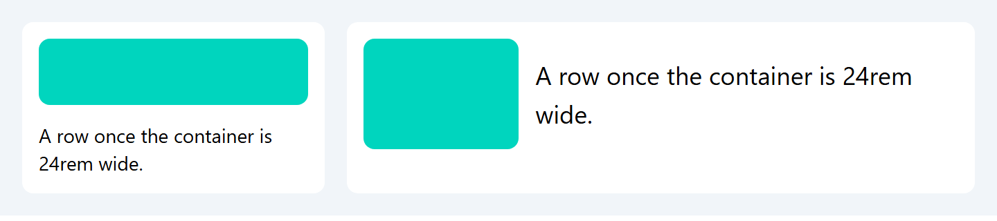
Also available: @max-md:, ranges like @sm:@max-lg:, named containers (@container/main, @lg/main:), @min-[475px]:, units such as w-[50cqw], and @container-size (v4.3) for block-size queries. Use viewport variants for page layout and container variants for reusable components.