The classic advice is to name classes after what content is (.profile-card) and keep how it looks in the stylesheet. Adam Wathan, Tailwind 5,202 's creator, challenged this in his 2017 essay "CSS Utility Classes and 'Separation of Concerns'" by pointing at dependency direction. With semantic classes the HTML stays clean but the CSS depends on its structure, so every new component needs new CSS and nobody dares delete old rules. With utilities the HTML depends on a fixed set of reusable classes, so the stylesheet stops growing, and unused styles are never generated.
The listing builds the same card both ways. The left card needs a stylesheet written for it; the right card uses only Tailwind classes, generated in the page by the @tailwindcss/browser build (Installation Options).
<script src="https://cdn.jsdelivr.net/npm/@tailwindcss/browser@4.3.3"></script>
<style>
  .profile-card { display: flex; align-items: center; gap: 12px; padding: 16px;
    border-radius: 12px; background: #fff; box-shadow: 0 4px 12px rgb(0 0 0 / 0.12); }
  .profile-card__avatar { width: 48px; height: 48px; border-radius: 50%; background: #0284c7; }
  .profile-card__name { font-weight: 600; }
  .profile-card__role { color: #64748b; font-size: 14px; }
</style>
<div class="flex gap-4 bg-slate-100 p-4 font-sans">
  <article class="profile-card">
    <div class="profile-card__avatar"></div>
    <div><p class="profile-card__name">Ada Park</p>
      <p class="profile-card__role">Front-end lead</p></div>
  </article>
  <article class="flex items-center gap-3 rounded-xl bg-white p-4 shadow-lg">
    <div class="size-12 rounded-full bg-sky-600"></div>
    <div><p class="font-semibold">Ada Park</p>
      <p class="text-sm text-slate-500">Front-end lead</p></div>
  </article>
</div>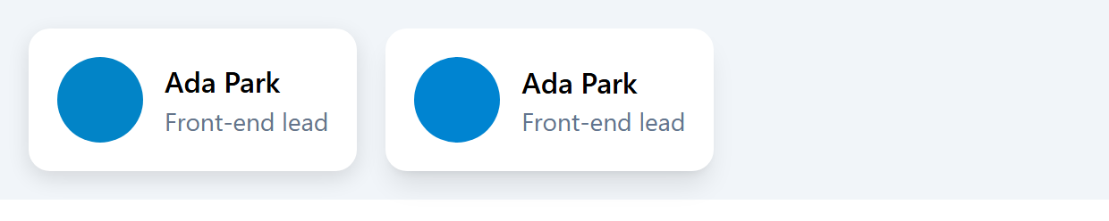
The results match, but the utility card needs no names and its styling sits where you read the markup. Each class maps to a token: gap-3 is three steps of the spacing scale, text-slate-500 a palette color, so designs stay consistent. Utilities also carry states and breakpoints (hover:shadow-xl md:flex-col).
Long class lists and repetition are the real cost. When the same fifteen classes appear on every button, do not reach for @apply to rebuild .btn; extract a component (React 7,897 , Vue 5,482 , a Blade or Jinja 15,439 partial) or loop over data, so the classes exist once in source code.