Alignment utilities work in both flex and grid containers. The prefix tells you the property: justify-* is justify-content, items-* is align-items, content-* is align-content, self-* is align-self, and place-* sets both axes at once. justify-start compiles to flex-start, which acts as start in grid.
| Utility | CSS |
|---|---|
| gap-4, gap-x-8, gap-y-2 | gap: 1rem, column-gap: 2rem, row-gap |
| justify-between, -center, -evenly | justify-content: space-between ... |
| justify-items-center, justify-self-end | justify-items: center, justify-self: end |
| items-center, -baseline, -stretch | align-items: center, baseline, stretch |
| content-start, content-between | align-content: flex-start, space-between |
| self-end, self-auto, self-baseline-last | align-self: flex-end, auto, last baseline |
| place-items-center, place-self-start... | place-items: center (both axes) |
| justify-center-safe, items-end-safe | safe center, safe flex-end |
<script src="https://cdn.jsdelivr.net/npm/@tailwindcss/browser@4.3.3"></script>
<div class="grid grid-cols-2 gap-3 p-4 font-sans text-sm *:h-16 *:rounded-lg *:bg-slate-100">
  <div class="grid place-items-center"><span class="rounded bg-sky-600 px-2 text-white">
    grid place-items-center</span></div>
  <div class="flex items-center justify-between px-3">
    <b>Logo</b><span>justify-between</span>
    <button class="rounded bg-sky-600 px-2 text-white">Go</button>
  </div>
  <div class="flex items-baseline gap-2 px-3 pt-3">
    <span class="text-3xl font-bold">42</span><span>items-baseline</span></div>
  <div class="flex items-start gap-2 p-2 *:rounded *:bg-emerald-600 *:px-2 *:text-white">
    <span>start</span><span class="self-center">self-center</span>
    <span class="self-end">self-end</span>
  </div>
</div>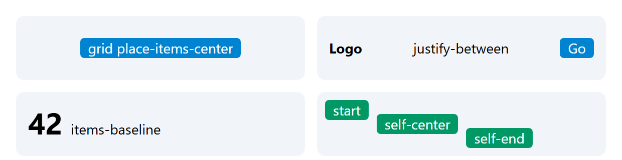
In the third box the large number and the label share a text baseline, which items-center would not give you; in the fourth, self-* overrides the container's items-start for single items.
The -safe variants, added in v4.1, fall back to start when content overflows: a centered tab row too wide for a phone spills off both edges and its left part cannot be scrolled to, which justify-center-safe prevents.