Container utilities set direction and wrapping; item utilities set how each child grows, shrinks and orders itself. The flex-<number> shorthand is the one that trips people up: flex-1 is flex: 1, which means grow from a zero basis, so flex-1 siblings share space equally regardless of content.
| Utility | CSS |
|---|---|
| flex-row, flex-col, flex-col-reverse... | flex-direction: row, column ... |
| flex-wrap, flex-nowrap, flex-wrap-reverse | flex-wrap: wrap, nowrap, wrap-reverse |
| flex-1, -auto, -initial, -none | flex: 1, auto, 0 auto, none |
| grow, grow-0, shrink, shrink-0 | flex-grow: 1, 0; flex-shrink: 1, 0 |
| basis-64, basis-1/3, basis-sm | flex-basis: 16rem, 33.333%, 24rem |
| order-2, order-first, order-last | order: 2, -9999, 9999 |
The demo builds two everyday components: an app bar whose search field takes the leftover space, and a wrapping tag list whose items keep their natural width.
<script src="https://cdn.jsdelivr.net/npm/@tailwindcss/browser@4.3.3"></script>
<div class="space-y-4 p-4 font-sans text-sm">
  <header class="flex items-center gap-3 rounded-lg bg-slate-800 p-2 text-white">
    <div class="size-9 shrink-0 rounded-full bg-sky-500"></div>
    <input class="min-w-0 flex-1 rounded bg-slate-700 px-3 py-2" placeholder="Search (flex-1)">
    <button class="order-last shrink-0 rounded bg-sky-600 px-3 py-2">Sign in</button>
    <nav class="flex shrink-0 gap-3"><a>Docs</a><a>Blog</a></nav>
  </header>
  <ul class="flex flex-wrap gap-2 *:rounded-full *:bg-emerald-100 *:px-3 *:py-1">
    <li>flexbox</li><li>grid</li><li>cascade layers</li>
    <li>@theme</li><li>subgrid</li><li>Preflight</li>
  </ul>
</div>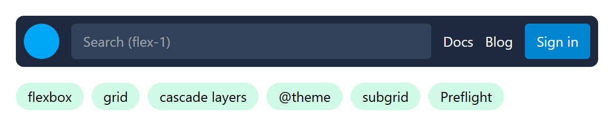
order-last moves the button after the navigation without touching the markup, but screen readers and the Tab key still follow source order, so keep order-* for visual tweaks only. The min-w-0 on the search field matters too: flex items default to min-width: auto and will not shrink below their content.