filter post-processes an element and its descendants as one image, applying functions left to right: blur(), brightness(), contrast(), drop-shadow(), grayscale(), hue-rotate(), invert(), opacity(), saturate(), sepia(), or url(#id) for an SVG <filter>. Unlike box-shadow, drop-shadow() follows the alpha channel, so it hugs a star or a transparent PNG. backdrop-filter (Baseline 2024) filters what lies behind the element, seen through its translucent background.
mix-blend-mode blends an element with what lies beneath, using the modes of graphics editors: multiply, screen, overlay, darken, lighten, color-dodge, color-burn, hard-light, soft-light, difference, exclusion, hue, saturation, color, luminosity. isolation: isolate on a parent keeps the blending inside it.
For <img> and <video>, object-fit works like background-size (fill, the stretching default, contain, cover, none, scale-down), and object-position picks the visible part. image-rendering: pixelated enlarges pixel art and QR codes with nearest-neighbor sampling.
<style>
body { display: grid; grid-template-columns: repeat(5, 120px); gap: 6px 10px; margin: 8px;
font: 12px system-ui; text-align: center; }
p { margin: 0; } p::after { content: attr(data-l); display: block; }
i, img, canvas { display: block; position: relative; width: 120px; height: 80px; }
.s { background: radial-gradient(circle at 70% 35%, #ffca28 12%, #0000 13%),
linear-gradient(#0000 60%, #2e7d32 0), linear-gradient(#1565c0, #e3f2fd); }
.s i { position: absolute; inset: 0 0 0 50%; background: #fff3; backdrop-filter: blur(4px); }
b { position: absolute; inset: 0; font: 900 36px/80px sans-serif; color: #fff;
mix-blend-mode: difference; }
img { background: #eceff1; } canvas { image-rendering: pixelated; }
</style>
<p data-l="original"><i class="s"></i></p>
<p data-l="grayscale(1)"><i class="s" style="filter: grayscale(1)"></i></p>
<p data-l="hue-rotate(160deg)"><i class="s" style="filter: hue-rotate(160deg)"></i></p>
<p data-l="blur(3px)"><i class="s" style="filter: blur(3px)"></i></p>
<p data-l="drop-shadow()"><i style="font: 64px serif; color: #ef6c00;
filter: drop-shadow(4px 4px 2px #6a1b9a)">★</i></p>
<p data-l="backdrop-filter"><i class="s"><i></i></i></p>
<p data-l="mix-blend-mode"><i class="s"><b>CSS</b></i></p>
<p data-l="object-fit: cover"><img style="object-fit: cover"></p>
<p data-l="object-fit: contain"><img style="object-fit: contain"></p>
<p data-l="pixelated"><canvas width="4" height="4"></canvas></p>
<script>
const svg = '<svg xmlns="http://www.w3.org/2000/svg" width="60" height="120"><rect width="60" ' +
'height="120" fill="#6a1b9a"/><circle cx="30" cy="60" r="26" fill="#ffca28"/></svg>';
for (const img of document.images) img.src = 'data:image/svg+xml,' + encodeURIComponent(svg);
const c = document.querySelector('canvas').getContext('2d');
for (let i = 0; i < 16; i++) c.fillStyle = `hsl(${i*22} 70% 50%)`, c.fillRect(i%4, i>>2, 1, 1);
</script>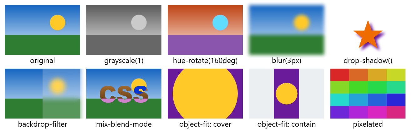
For print, print-color-adjust: exact (Baseline 2025) keeps backgrounds the browser would drop to save ink.