A smooth animation delivers a frame every 16.7 ms at 60 Hz. The pipeline stages a property re-runs (How CSS Becomes Pixels) decide whether the main thread must lay out and paint every frame, or the compositor thread can simply move an already painted texture.
| Stage re-run each frame | Typical properties | Verdict |
|---|---|---|
| Layout, paint, composite | width, height, top, left, margin | Avoid animating |
| Paint, composite | color, background, box-shadow | Small areas only |
| Composite only | transform, translate, rotate, scale, opacity | Preferred |
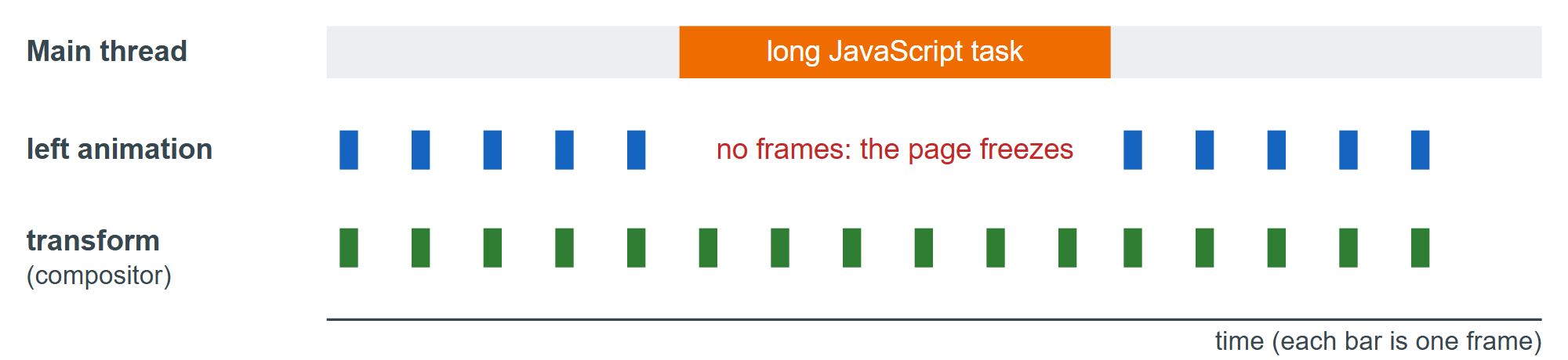
Fake layout-heavy effects with transforms: scale a pre-sized element instead of changing its width, and fade in a pseudo-element carrying the box-shadow instead of animating the shadow.
will-change
will-change: transform, opacity lets the browser promote the element to its own compositor layer ahead of time, avoiding a repaint at the first frame. Side effects: those values create a stacking context immediately, and every layer holds a GPU texture, so * { will-change: transform; } can exhaust memory on phones. Browsers promote animating elements anyway, so use it only to fix a measured problem, just before the change:
.drawer { transition: translate .3s ease-out; }
.menu-area:hover .drawer, .drawer.is-open { will-change: translate; }  /* removed otherwise */
In DevTools, the Performance panel shows dropped frames, the Rendering tab's Paint flashing and Layer borders reveal repaints and layers, and the Layers panel reports layer memory.