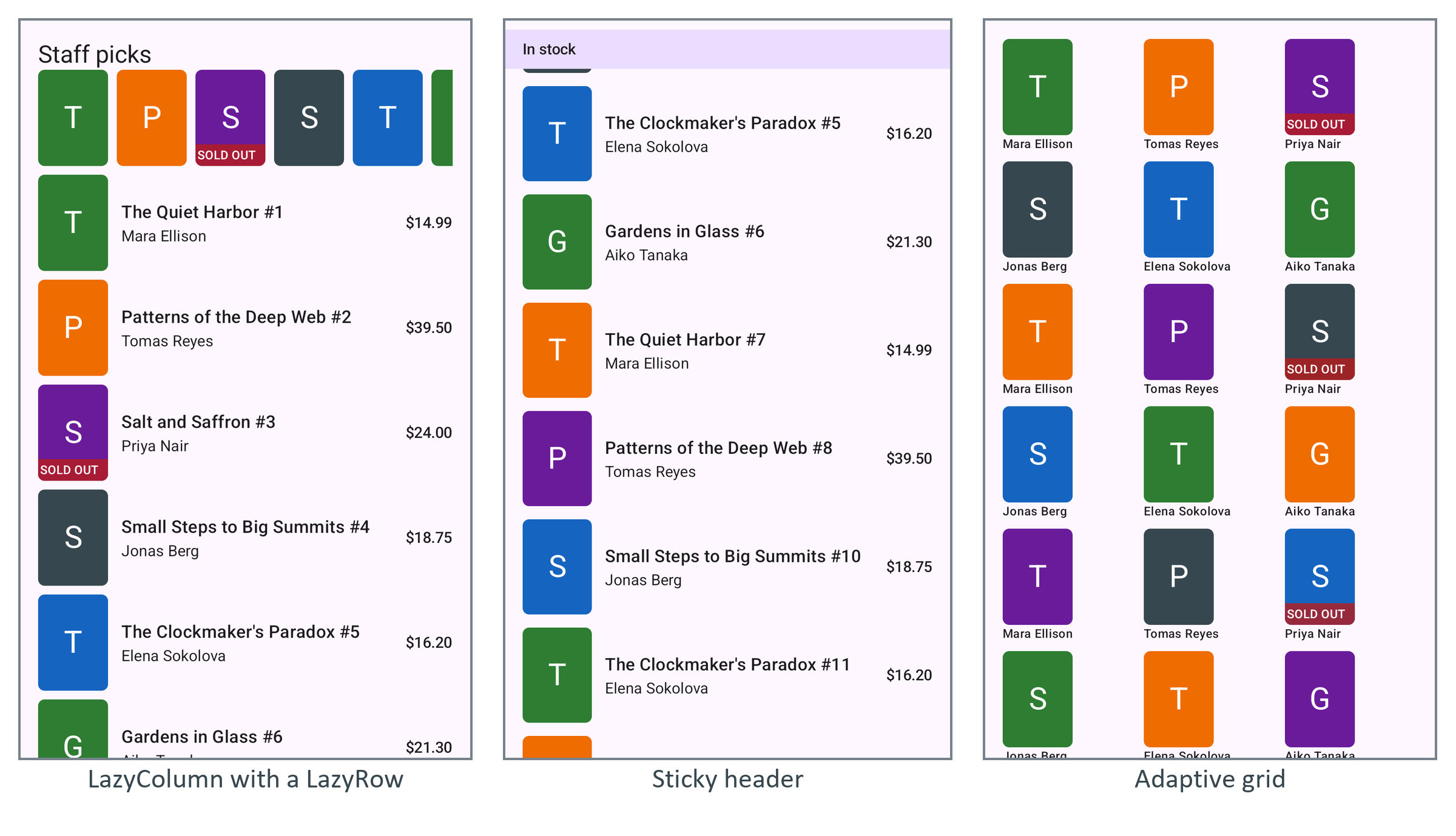
stickyHeader { } stays pinned while its section scrolls beneath it, like SectionList headers (SectionList). Give it an opaque background:
  val byStock = books.groupBy { if (it.inStock) "In stock" else "Sold out" }
  LazyColumn(contentPadding = PaddingValues(bottom = 16.dp)) {
    byStock.forEach { (label, group) ->
      stickyHeader(key = label) {
        Text(label, Modifier.fillMaxWidth()
          .background(MaterialTheme.colorScheme.primaryContainer)   // opaque, rows slide under
          .padding(16.dp, 8.dp), style = MaterialTheme.typography.titleSmall)
      }
      items(group, key = { it.id }) { BookRow(it, Modifier.padding(16.dp, 6.dp)) }
    }
  }
LazyVerticalGrid adds a GridCells policy: Fixed(3), or Adaptive(minSize = 96.dp) for as many 96 dp columns as fit, so a tablet gets more columns for free:
  LazyVerticalGrid(GridCells.Adaptive(minSize = 96.dp), contentPadding = PaddingValues(16.dp),
    horizontalArrangement = Arrangement.spacedBy(8.dp),
    verticalArrangement = Arrangement.spacedBy(8.dp)) {
    items(books, key = { it.id }) { book ->
      Column { Cover(book); Text(book.author, style = MaterialTheme.typography.labelSmall) }
    }
  }
contentPadding pads the scrolling content, not the frame: the first and last items start inset, yet rows still scroll under the edge, as edge-to-edge screens need. Modifier.padding would clip them instead.