TalkBack, Switch Access and Voice Access don't see pixels. They see the semantics tree, which Compose 234 builds from your composables and exposes as AccessibilityNodeInfo objects, as a browser builds the accessibility tree from HTML. Text contributes its text, Icon its contentDescription, clickable an action and a role. Shape the tree so that each stop makes sense when read aloud:
@Composable
fun AccessibleBookRow(book: Book, favorite: Boolean, onFavorite: (Boolean) -> Unit) {
  Row(Modifier.fillMaxWidth().semantics(mergeDescendants = true) {},  // one stop per book
    verticalAlignment = Alignment.CenterVertically) {
    Cover(book, Modifier.clearAndSetSemantics {})       // decorative: the title says it all
    Column(Modifier.weight(1f).padding(horizontal = 12.dp)) {
      Text(book.title, style = MaterialTheme.typography.titleMedium)
      Text("${book.author}, $%.2f".format(book.price))
    }
    val state = if (favorite) "Saved" else "Not saved"
    IconToggleButton(favorite, onFavorite, Modifier.semantics { stateDescription = state }) {
      Icon(if (favorite) Icons.Filled.Favorite else Icons.Filled.FavoriteBorder,
        contentDescription = "Save ${book.title}")
    }
  }
}
mergeDescendants = true folds the texts into one node, so TalkBack reads title, author and price as one stop. clearAndSetSemantics {} hides the cover's letter "T". The toggle keeps its own node because it has its own action, and stateDescription puts its state in words. The heading above the rows gets Modifier.semantics { heading() }, so TalkBack users can jump between headings. The demo logs the merged tree (getAllSemanticsNodes(mergingEnabled = true), what printToLog() prints in a UI test, Testing) with each node's touch bounds:
D/BookNestTheme: node 5 117x32dp text=[Staff picks], heading
D/BookNestTheme: node 6 379x88dp text=[The Quiet Harbor, Mara Ellison, $14.99]
...
D/BookNestTheme: node 29 48x48dp desc=[Save Salt and Saffron], state=Saved, role=Checkbox
D/BookNestTheme: node 32 48x48dp desc=[About (too small)], role=Image
D/BookNestTheme: node 33 48x48dp desc=[About], role=Image
The last two lines are clickable 24 dp Icons, yet both report 48 by 48 dp, Material's minimum: Compose extends a small clickable's touch bounds beyond the composable. That extension takes no layout space, so it can overlap neighbors. Modifier.minimumInteractiveComponentSize() on the second icon reserves the space, as the Show layout bounds developer option reveals:
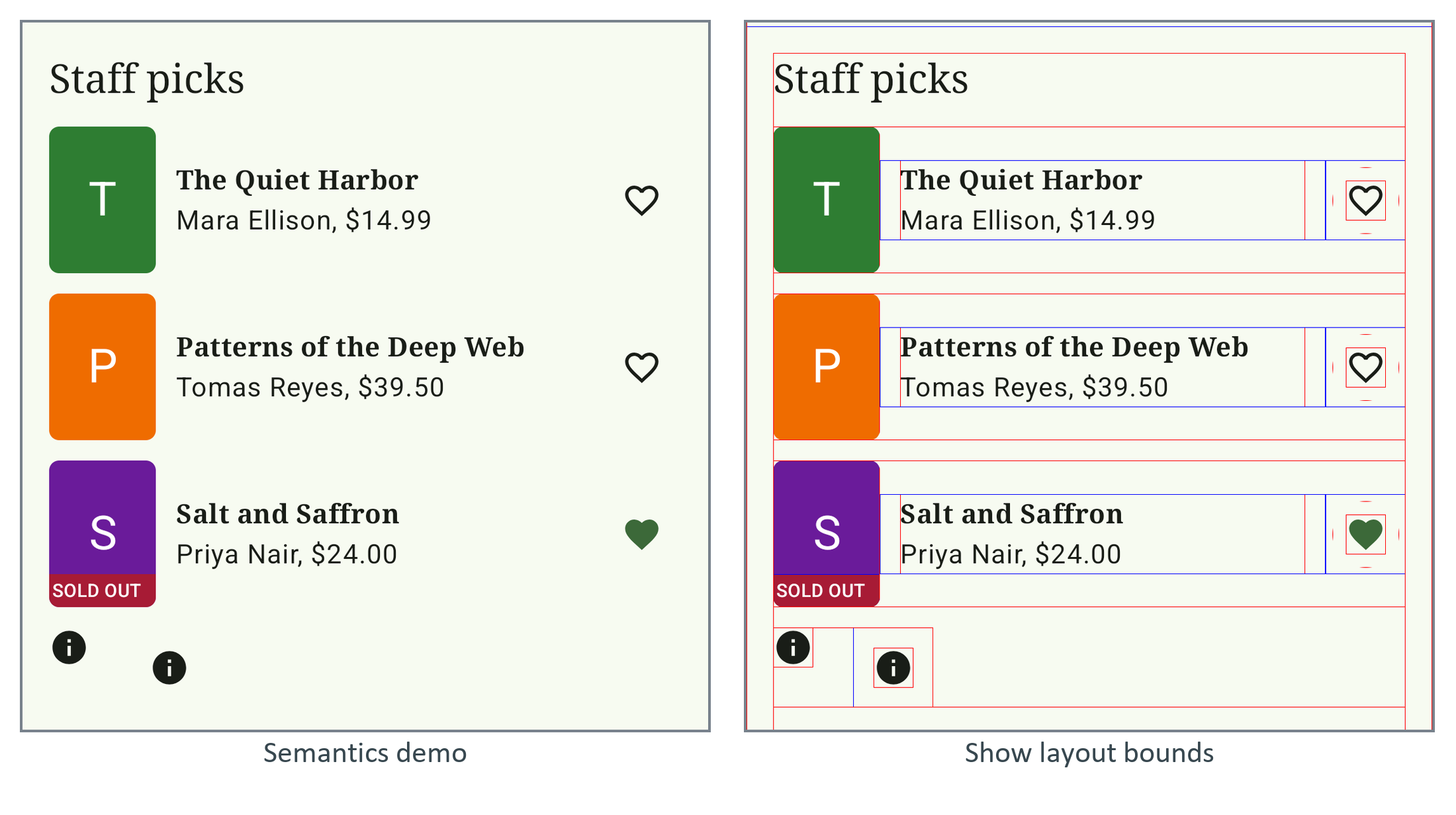
Material's IconButton and Switch already do. The log shows one more flaw: the bare icons announce "Image", so pass role = Role.Button and an onClickLabel to clickable.
Testing with TalkBack (not run here): the google_apis emulator image has no TalkBack, hence the log. On a device, install Android Accessibility Suite, turn TalkBack on and swipe through every screen; each stop should say what it is, its state and what a double-tap does. Accessibility Scanner flags small targets and low contrast.