.img-fluid sets max-width: 100%; height: auto, so an image never overflows its container. .img-thumbnail adds padding, a 1px border and rounded corners; .rounded and .rounded-circle change only the corners. Float images with .float-start and .float-end (Bootstrap 4 2,007 's .float-left and .float-right), or center one with .d-block .mx-auto. A captioned image uses .figure, .figure-img and .figure-caption. Inside <picture>, put the classes on the <img>.
<link rel="stylesheet"
  href="https://cdn.jsdelivr.net/npm/bootstrap@5.3.8/dist/css/bootstrap.min.css">
<div class="p-3 d-flex gap-3 align-items-start">
  <img src="https://picsum.photos/seed/frog/120/120" class="img-thumbnail" alt="Mountain">
  <img src="https://picsum.photos/seed/frog/120/120" class="rounded-circle" alt="Mountain">
  <figure class="figure">
    <img src="https://picsum.photos/seed/lake/400/200" class="figure-img img-fluid rounded"
      alt="Harbor">
    <figcaption class="figure-caption text-end">Scaled to fit its column.</figcaption>
  </figure>
</div>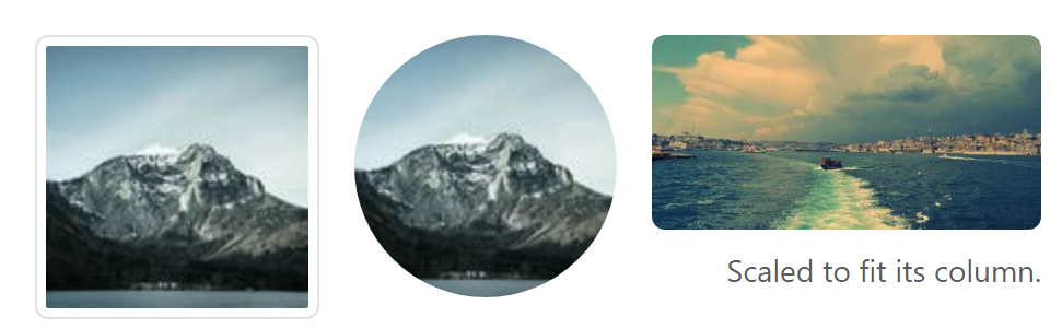
Always set alt, plus width and height so the browser reserves space before the image loads.