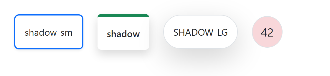
.shadow-sm, .shadow and .shadow-lg add a translucent box-shadow that grows from 0 .125rem .25rem to 0 1rem 3rem, and .shadow-none removes a component's default shadow. Reserve shadows for things that float above the page, such as dropdowns and sticky headers. The demo combines them with border and text utilities.
<link rel=stylesheet href="https://cdn.jsdelivr.net/npm/bootstrap@5.3.8/dist/css/bootstrap.min.css">
<div class="d-flex gap-4 p-4 align-items-center text-center text-nowrap">
  <div class="p-3 border border-2 border-primary rounded-3 shadow-sm">shadow-sm</div>
  <div class="p-3 border-top border-5 border-success rounded shadow fw-semibold">shadow</div>
  <div class="p-3 border rounded-pill shadow-lg text-uppercase">shadow-lg</div>
  <div class="py-3 fs-5 lh-1 border rounded-circle bg-danger-subtle" style="width: 3.25rem">42</div>
</div>