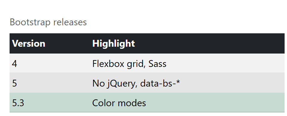
A bare <table> stays unstyled; add .table, then combine modifiers: .table-striped (or .table-striped-columns), .table-hover, .table-bordered or .table-borderless, and .table-sm for half the cell padding. Color variants .table-primary to .table-dark work on a table, row or cell and replace Bootstrap 4 2,007 's .thead-dark. .table-active highlights a row, .table-group-divider thickens a group border, .caption-top moves the caption up, and a .table-responsive wrapper scrolls wide tables sideways on small screens.
<link rel="stylesheet"
  href="https://cdn.jsdelivr.net/npm/bootstrap@5.3.8/dist/css/bootstrap.min.css">
<div class="table-responsive p-3">
  <table class="table table-striped table-hover table-sm caption-top">
    <caption>Bootstrap releases</caption>
    <thead class="table-dark"><tr><th>Version</th><th>Highlight</th></tr></thead>
    <tbody class="table-group-divider">
      <tr><td>4</td><td>Flexbox grid, Sass</td></tr>
      <tr class="table-active"><td>5</td><td>No jQuery, data-bs-*</td></tr>
      <tr class="table-success"><td>5.3</td><td>Color modes</td></tr>
    </tbody>
  </table>
</div>