The .btn class works on <button>, <a> and <input type="submit">. On its own it sets only padding, border and radius; add a color variant (.btn-primary, -secondary, -success, -danger, -warning, -info, -light, -dark, -link) or its outline twin (.btn-outline-primary), and optionally .btn-lg or .btn-sm. Give every <button> an explicit type, because inside a form the default is submit.
<link href="https://cdn.jsdelivr.net/npm/bootstrap@5.3.8/dist/css/bootstrap.min.css" rel=stylesheet>
<div class="p-3 d-flex flex-wrap gap-2 align-items-center">
  <button type="button" class="btn btn-primary">Primary</button>
  <button type="button" class="btn btn-outline-danger">Outline</button>
  <button type="button" class="btn btn-success btn-lg">Large</button>
  <button type="button" class="btn btn-dark btn-sm">Small</button>
  <button type="button" class="btn btn-warning active" data-bs-toggle="button"
    aria-pressed="true">Toggle on</button>
  <button type="button" class="btn btn-secondary" disabled>Disabled</button>
  <a class="btn btn-link disabled" role="button" aria-disabled="true">Link off</a>
  <button type="button" class="btn-close" aria-label="Close"></button>
  <span class="bg-dark p-2 rounded" data-bs-theme="dark">
    <button type="button" class="btn-close" aria-label="Close"></button></span>
  <button type="button" class="btn btn-primary w-100"
    style="--bs-btn-padding-y: .1rem; --bs-btn-font-size: .8rem">Custom size, full width</button>
</div>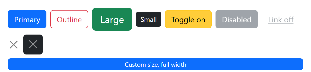
data-bs-toggle="button" makes the Button plugin flip .active and aria-pressed on each click. An <a> has no disabled attribute, so drop its href and add .disabled (pointer-events: none) and aria-disabled="true". Bootstrap 5.0 2,007 removed .btn-block: use .w-100 or a .d-grid wrapper, and resize through --bs-btn-padding-y, --bs-btn-padding-x and --bs-btn-font-size, as the last button does.