Layout comes before colors and components, and Bootstrap 2,007 's grid is the part of the framework you will use on almost every page. A container holds rows, rows hold columns, and your content goes inside the columns. The grid is built with flexbox (Flexbox), divides each row into 12 units and switches layouts at six breakpoints.
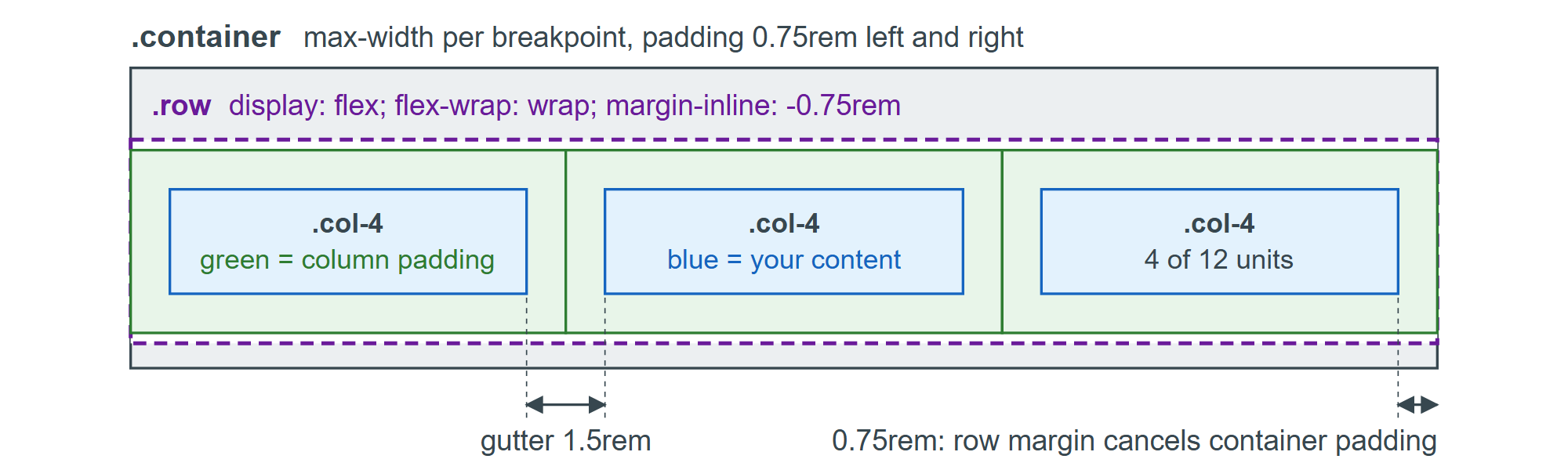
The listings in this section load the Bootstrap 5.3.8 stylesheet from Starter Template and Reboot and outline each column in blue. Their screenshots are 720 CSS pixels wide: past the sm breakpoint but short of md.