A Bootstrap 2,007 tooltip replaces the browser's plain title popup with a styled bubble that can take any side and contain simple HTML. Tooltips are opt-in for performance: nothing happens until you create an instance per trigger. The bundle includes Popper 32,753 , which positions them. Set the text with data-bs-title, the side with data-bs-placement (default top), and allow markup with data-bs-html="true"; Bootstrap's sanitizer still strips unsafe tags.
<link rel=stylesheet href="https://cdn.jsdelivr.net/npm/bootstrap@5.3.8/dist/css/bootstrap.min.css">
<div class="d-flex gap-5 px-3" style="padding-block: 3.5rem">
  <button class="btn btn-secondary" data-bs-toggle="tooltip" data-bs-title="On top">Top</button>
  <button class="btn btn-secondary" data-bs-toggle="tooltip" data-bs-placement="bottom"
    data-bs-title="Below">Bottom</button>
  <button class="btn btn-secondary" data-bs-toggle="tooltip" data-bs-placement="right"
    data-bs-html="true" data-bs-title="<b>Bold</b> <em>HTML</em>">Right</button>
</div>
<script src="https://cdn.jsdelivr.net/npm/bootstrap@5.3.8/dist/js/bootstrap.bundle.min.js"></script>
<script>
  const triggers = document.querySelectorAll('[data-bs-toggle="tooltip"]');
  triggers.forEach(el => new bootstrap.Tooltip(el).show()); // show() only for the screenshot
</script>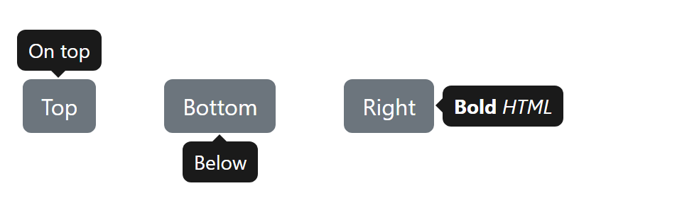
Tooltips with an empty title never show. A disabled button fires no mouse events, so put the tooltip on a wrapping <span tabindex="0">. The default trigger is 'hover focus', which also serves keyboard users.