A modal is a dialog over a dimmed backdrop that removes page scrolling while open. The structure is always .modal > .modal-dialog > .modal-content, with optional .modal-header, .modal-body and .modal-footer. Only one modal can be open at a time; place the markup at the top level of <body>. On .modal-dialog, .modal-sm (300px), .modal-lg (800px) and .modal-xl (1140px) change the default 500px width, and .modal-dialog-centered, .modal-dialog-scrollable and .modal-fullscreen-md-down change placement. On .modal, data-bs-backdrop="static" and data-bs-keyboard="false" stop outside clicks and Escape from closing it.
<link rel=stylesheet href="https://cdn.jsdelivr.net/npm/bootstrap@5.3.8/dist/css/bootstrap.min.css">
<button class="btn btn-danger m-3" data-bs-toggle="modal" data-bs-target="#confirm">Delete</button>
<div class="modal fade" id="confirm" tabindex="-1" aria-labelledby="confirmTitle">
  <div class="modal-dialog modal-dialog-centered">
    <div class="modal-content">
      <div class="modal-header">
        <h1 class="modal-title fs-5" id="confirmTitle">Delete report.pdf?</h1>
        <button type="button" class="btn-close" data-bs-dismiss="modal" aria-label="Close"></button>
      </div>
      <div class="modal-body">The file moves to the trash for 30 days.</div>
      <div class="modal-footer">
        <button type="button" class="btn btn-secondary" data-bs-dismiss="modal">Cancel</button>
        <button type="button" class="btn btn-danger">Delete</button>
      </div>
    </div>
  </div>
</div>
<script src="https://cdn.jsdelivr.net/npm/bootstrap@5.3.8/dist/js/bootstrap.bundle.min.js"></script>
<script>
  const modalEl = document.getElementById('confirm');
  modalEl.addEventListener('shown.bs.modal', () => modalEl.querySelector('.btn-danger').focus());
  bootstrap.Modal.getOrCreateInstance(modalEl).show(); // open it for the screenshot
</script>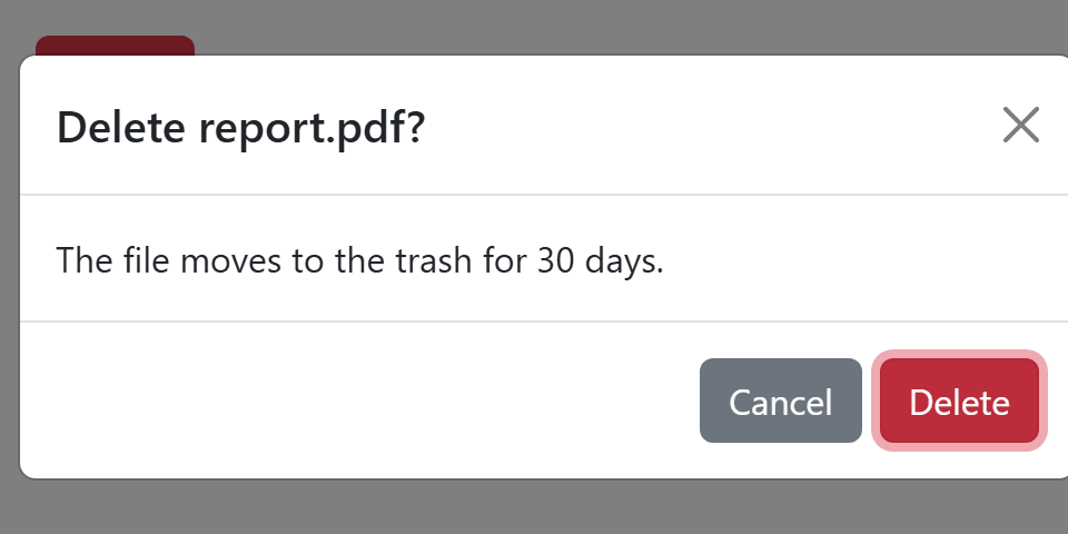
autofocus does not work inside a modal, hence the shown.bs.modal handler. In a show.bs.modal handler, event.relatedTarget is the button that opened the modal, so one modal can serve many buttons via their data-*.