An alert is a colored message box inside the page flow. Pick one of eight variants, .alert-primary through .alert-dark; .alert-link colors links to match and .alert-heading styles a title. For a dismissible alert, add .alert-dismissible .fade .show and a .btn-close with data-bs-dismiss="alert". Bootstrap 4 2,007 's .close button with an × character became .btn-close, which draws its X as an embedded SVG background image. The listing shows alerts in the flow and the toasts from Toast stacked in the corner.
<link rel=stylesheet href="https://cdn.jsdelivr.net/npm/bootstrap@5.3.8/dist/css/bootstrap.min.css">
<div class="p-3">
  <div class="alert alert-success" role="alert">
    <h4 class="alert-heading fs-6">Order placed</h4>
    Track it on the <a href="#" class="alert-link">orders page</a>.
  </div>
  <div class="alert alert-warning alert-dismissible fade show" role="alert">
    <strong>Warning:</strong> your session expires in 5 minutes.
    <button type="button" class="btn-close" data-bs-dismiss="alert" aria-label="Close"></button>
  </div>
</div>
<div class="toast-container position-fixed bottom-0 end-0 p-3">
  <div class="toast" role="status" aria-live="polite" aria-atomic="true">
    <div class="toast-header">
      <strong class="me-auto">Mail</strong><small>2 min ago</small>
      <button type="button" class="btn-close" data-bs-dismiss="toast" aria-label="Close"></button>
    </div>
    <div class="toast-body">You have 3 new messages.</div>
  </div>
  <div class="toast text-bg-success border-0" role="status" aria-live="polite" aria-atomic="true">
    <div class="d-flex">
      <div class="toast-body">Settings saved.</div>
      <button type="button" class="btn-close btn-close-white m-auto me-2"
        data-bs-dismiss="toast" aria-label="Close"></button>
    </div>
  </div>
</div>
<script src="https://cdn.jsdelivr.net/npm/bootstrap@5.3.8/dist/js/bootstrap.bundle.min.js"></script>
<script>for (const el of document.querySelectorAll('.toast'))
  new bootstrap.Toast(el, { autohide: false }).show();</script>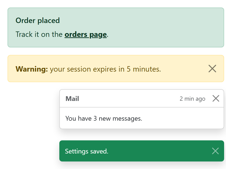
Closing an alert removes it from the DOM, so keyboard focus is lost. Listen for closed.bs.alert and move focus to a sensible element. Color alone does not reach screen reader users; make the text say "Error" or "Warning" too.