Sass 22,539 . The npm 2,036 package ships its source in scss/. The entry file bootstrap.scss only imports partials in a fixed order: configuration that emits no CSS (functions, variables, variables-dark, maps, mixins, utilities), then root, reboot, one partial per component, helpers and finally utilities/api. Every variable is declared !default, so a value you set before the imports wins; Customizing Bootstrap uses this to build a custom theme.
CSS variables. Compiled Sass cannot change at run time, so Bootstrap 5 2,007 also exposes its tokens as --bs-* custom properties (449 distinct names in 5.3.8): global ones on :root, dark-mode values under [data-bs-theme=dark], and local ones on components, such as --bs-btn-bg on .btn. Setting a component's local variables restyles it without specificity battles, and data-bs-theme="dark" switches any subtree to dark mode.
<link rel="stylesheet"
  href="https://cdn.jsdelivr.net/npm/bootstrap@5.3.8/dist/css/bootstrap.min.css">
<script src="https://cdn.jsdelivr.net/npm/bootstrap@5.3.8/dist/js/bootstrap.bundle.min.js"></script>
<style>
  .btn-brand { --bs-btn-bg: #6a1b9a; --bs-btn-color: #fff; --bs-btn-border-radius: 2rem; }
</style>
<div class="card m-3" data-bs-theme="dark" style="max-width: 22rem">
  <div class="card-body">
    <p class="card-text">Only this card uses the dark color mode.</p>
    <button class="btn btn-brand" data-bs-toggle="tooltip" data-bs-title="By Popper">Brand</button>
  </div>
</div>
<script>
  const btn = document.querySelector('[data-bs-toggle="tooltip"]');
  bootstrap.Tooltip.getOrCreateInstance(btn, { placement: 'right' }).show();
</script>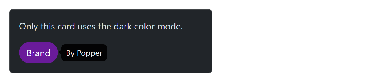
The utility API. Classes such as mt-3 and d-md-none are generated. _utilities.scss holds a Sass map whose entries name a CSS property, its values, a class prefix and flags such as responsive or state; utilities/api loops over it and prints each class with !important. Merging an entry "cursor": (property: cursor, class: cursor, responsive: true, values: auto pointer) into $utilities yields .cursor-pointer, .cursor-md-pointer and the rest.
Popper 32,753 and plugins. Dropdowns, popovers and tooltips use Popper 2 (included in the bundle) to stay attached to their trigger and flip at the viewport edge. Every plugin is configured through data-bs-* attributes, has a JavaScript API (new Modal(el, options), Modal.getOrCreateInstance(el)), and fires cancelable events in pairs such as show.bs.modal (before) and shown.bs.modal (after).