Each theme color (primary, secondary, success, danger, warning, info, light, dark) generates the families below. The subtle and emphasis shades, new in 5.3.0, are designed to be combined and change with the color mode. .text-muted (deprecated in 5.3.0) gives way to .text-body-secondary; it and .text-black-50 and .text-white-50 (deprecated in 5.1.0) disappear in version 6.
| Classes | Result |
|---|---|
| .text-primary, .bg-primary, .border-primary | Solid color |
| .text-bg-primary | Background plus readable text |
| .bg-primary-subtle, .text-primary-emphasis | Soft tint, adapts to mode |
| .text-body-secondary, .bg-body-tertiary | Neutral page shades |
| .text-opacity-50, .bg-opacity-25 | Transparency |
Since 5.3.0, data-bs-theme="dark" switches to dark mode. On <html> it themes the page; on an element it themes only that subtree, because the attribute redefines variables such as --bs-body-bg (#212529 in dark mode) that components read. The demo clones a card and marks the copy dark.
<link rel=stylesheet href="https://cdn.jsdelivr.net/npm/bootstrap@5.3.8/dist/css/bootstrap.min.css">
<div class="d-flex gap-3 p-3">
  <div class="card p-3 w-50">
    <h6 class="text-body-emphasis">Build <span class="badge text-bg-success">passed</span></h6>
    <p class="text-body-secondary small">Deployed 3 minutes ago</p>
    <div class="p-2 rounded bg-warning-subtle text-warning-emphasis border border-warning-subtle">
      2 warnings</div>
  </div>
</div>
<script>
  const card = document.querySelector('.card'), copy = card.cloneNode(true);
  copy.dataset.bsTheme = 'dark';
  card.after(copy);
</script>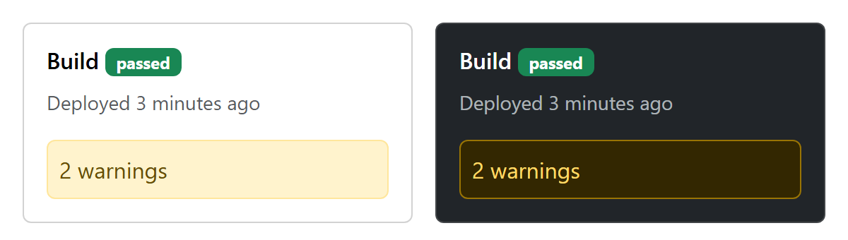
To follow the operating system and remember the user's choice, set the attribute in <head> before the page paints:
const stored = localStorage.getItem('theme');
const dark = matchMedia('(prefers-color-scheme: dark)').matches;
document.documentElement.dataset.bsTheme = stored ?? (dark ? 'dark' : 'light');
In 5.3, plain theme classes such as .text-primary do not adapt to dark mode; the -emphasis classes do.