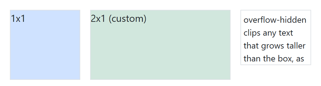
Wrap an <iframe>, <video> or <div> in .ratio plus .ratio-1x1, .ratio-4x3, .ratio-16x9 or .ratio-21x9 and the child fills a box that keeps that shape at any width, which is how you make an embedded YouTube 9 player responsive. For another shape, set --bs-aspect-ratio to the height as a percentage of the width.
<link rel=stylesheet href="https://cdn.jsdelivr.net/npm/bootstrap@5.3.8/dist/css/bootstrap.min.css">
<div class="d-flex gap-3 p-3 align-items-start">
  <div class="ratio ratio-1x1 w-25"><div class="bg-primary-subtle border">1x1</div></div>
  <div class="ratio w-50" style="--bs-aspect-ratio: 50%">
    <div class="bg-success-subtle border">2x1 (custom)</div></div>
  <div class="w-25 overflow-hidden border small p-1" style="height: 90px">
    overflow-hidden clips any text that grows taller than the box, as it does here.</div>
</div>