.nav is an undecorated flex row of .nav-link elements. Style it with .nav-tabs, .nav-pills or .nav-underline (new in 5.3.0); .flex-column stacks the links, .nav-fill stretches them in proportion to their text, and .nav-justified makes them equal width. For tabs, make each control a <button> with data-bs-toggle="tab" (or "pill") and a data-bs-target pointing at a .tab-pane inside .tab-content, and add the ARIA roles tablist, tab and tabpanel.
<link rel="stylesheet"
  href="https://cdn.jsdelivr.net/npm/bootstrap@5.3.8/dist/css/bootstrap.min.css">
<div class="p-3">
  <nav class="nav nav-underline mb-3" aria-label="Sections">
    <a class="nav-link active" aria-current="page" href="#">Overview</a>
    <a class="nav-link" href="#">Pricing</a>
  </nav>
  <div class="nav nav-pills nav-justified bg-body-tertiary rounded" role="tablist">
    <button class="nav-link" data-bs-toggle="pill" data-bs-target="#html"
      role="tab" aria-selected="false">HTML</button>
    <button class="nav-link active" data-bs-toggle="pill" data-bs-target="#css"
      role="tab" aria-selected="true">CSS</button>
    <button class="nav-link" data-bs-toggle="pill" data-bs-target="#js"
      role="tab" aria-selected="false">JavaScript</button>
  </div>
  <div class="tab-content border rounded p-3 mt-2">
    <div class="tab-pane fade" id="html" role="tabpanel">Structure (Chapter 2).</div>
    <div class="tab-pane fade show active" id="css" role="tabpanel">Presentation (Chapter 4).</div>
    <div class="tab-pane fade" id="js" role="tabpanel">Behavior (Chapter 6).</div>
  </div>
</div>
<script src="https://cdn.jsdelivr.net/npm/bootstrap@5.3.8/dist/js/bootstrap.bundle.min.js"></script>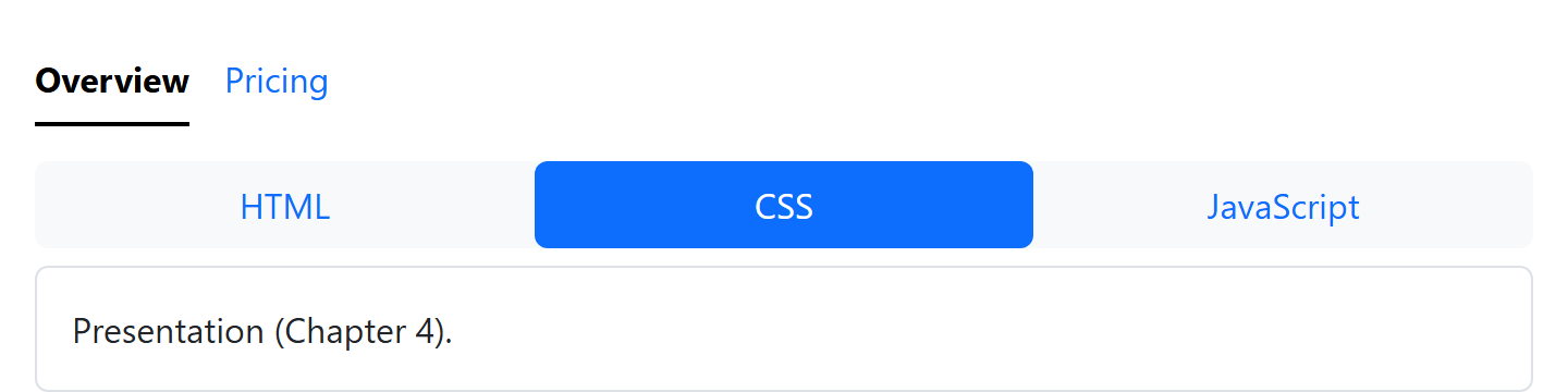
The initially selected tab and its pane carry .active (the pane also .show, for the .fade effect). From script, bootstrap.Tab.getOrCreateInstance(button).show() selects a tab as a click would; Bootstrap 2,007 then fires hide.bs.tab, show.bs.tab, hidden.bs.tab and shown.bs.tab. The plugin follows the WAI-ARIA tabs pattern, handling arrow keys, Home and End, but does not support dropdowns inside tabs.