A landing page combines the grid, the navbar, cards and utilities. This one advertises a fictional task manager, Taskly, using Bootstrap 2,007 classes alone and no custom CSS. Place both listings, in order, inside the <body> of the starter template from Starter Template and Reboot; each repeats only the stylesheet links so that it renders on its own.
<link rel="stylesheet"
  href="https://cdn.jsdelivr.net/npm/bootstrap@5.3.8/dist/css/bootstrap.min.css">
<nav class="navbar navbar-expand-sm bg-body-tertiary border-bottom sticky-top">
  <div class="container-lg">
    <a class="navbar-brand fw-bold" href="#">Taskly</a>
    <button class="navbar-toggler" type="button" data-bs-toggle="collapse" data-bs-target="#mainNav"
      aria-controls="mainNav" aria-expanded="false" aria-label="Toggle navigation">
      <span class="navbar-toggler-icon"></span>
    </button>
    <div class="collapse navbar-collapse" id="mainNav">
      <ul class="navbar-nav ms-auto">
        <li class="nav-item"><a class="nav-link" href="#features">Features</a></li>
        <li class="nav-item"><a class="nav-link" href="#pricing">Pricing</a></li>
      </ul>
      <a class="btn btn-primary ms-sm-3" href="#pricing">Start free</a>
    </div>
  </div>
</nav>
<header class="container-lg py-5 text-center">
  <span class="badge rounded-pill text-bg-primary mb-3">New: team calendars</span>
  <h1 class="display-5 fw-bold">Plan less. Ship more.</h1>
  <p class="lead text-body-secondary">Tasks, deadlines and discussions on one board.</p>
  <div class="d-grid gap-2 d-sm-flex justify-content-sm-center">
    <a class="btn btn-primary btn-lg px-4" href="#pricing">Try it free</a>
    <a class="btn btn-outline-secondary btn-lg px-4" href="#features">See features</a>
  </div>
</header>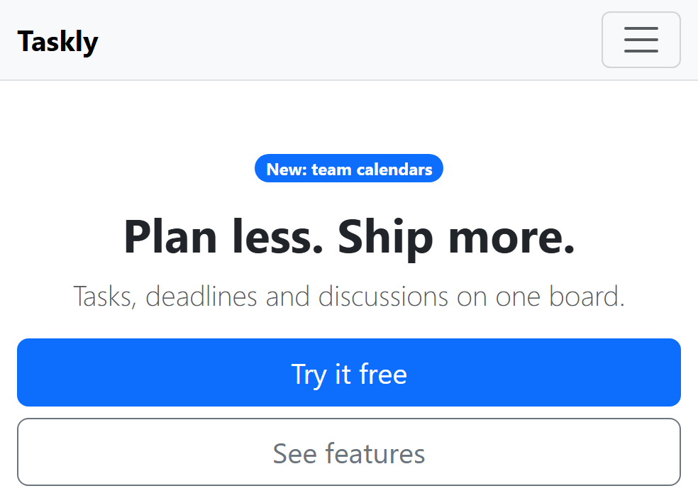
<link rel="stylesheet"
href="https://cdn.jsdelivr.net/npm/bootstrap@5.3.8/dist/css/bootstrap.min.css">
<link rel="stylesheet"
href="https://cdn.jsdelivr.net/npm/bootstrap-icons@1.13.1/font/bootstrap-icons.min.css">
<section id="features" class="bg-body-tertiary py-5">
<div class="container-lg">
<h2 class="text-center mb-4">Why teams switch</h2>
<div class="row row-cols-1 row-cols-sm-3 g-4">
<div class="col"><i class="bi bi-kanban fs-2 text-primary"></i>
<h3 class="h5 mt-2">Boards and lists</h3>
<p class="text-body-secondary">Drag tasks through stages and see who owns each one.</p>
</div>
<div class="col"><i class="bi bi-lightning-charge fs-2 text-primary"></i>
<h3 class="h5 mt-2">Automations</h3>
<p class="text-body-secondary">Move, assign and remind without writing a script.</p>
</div>
<div class="col"><i class="bi bi-graph-up fs-2 text-primary"></i>
<h3 class="h5 mt-2">Reports</h3>
<p class="text-body-secondary">Spot late work early with weekly burn-down charts.</p>
</div>
</div>
</div>
</section>
<section id="pricing" class="container-lg py-5">
<h2 class="text-center mb-4">Simple pricing</h2>
<div class="row row-cols-1 row-cols-sm-3 g-4 text-center">
<div class="col"><div class="card card-body h-100">
<h3 class="h6 text-uppercase text-body-secondary">Free</h3>
<p class="display-6 fw-bold">$0</p>
<p>3 projects, 2 members</p>
<a class="btn btn-outline-primary" href="#">Sign up</a>
</div></div>
<div class="col"><div class="card card-body h-100 border-primary shadow">
<h3 class="h6 text-uppercase text-primary">Pro
<span class="badge text-bg-primary">Popular</span></h3>
<p class="display-6 fw-bold">$9</p>
<p>Unlimited projects</p>
<a class="btn btn-primary" href="#">Start trial</a>
</div></div>
<div class="col"><div class="card card-body h-100">
<h3 class="h6 text-uppercase text-body-secondary">Business</h3>
<p class="display-6 fw-bold">$19</p>
<p>SSO and audit log</p>
<a class="btn btn-outline-primary" href="#">Contact sales</a>
</div></div>
</div>
</section>
<footer class="border-top py-3">
<div class="container-lg d-flex flex-wrap justify-content-between small text-body-secondary">
<span>© 2026 Taskly, Inc.</span>
<a class="link-secondary" href="#">Privacy and terms</a>
</div>
</footer>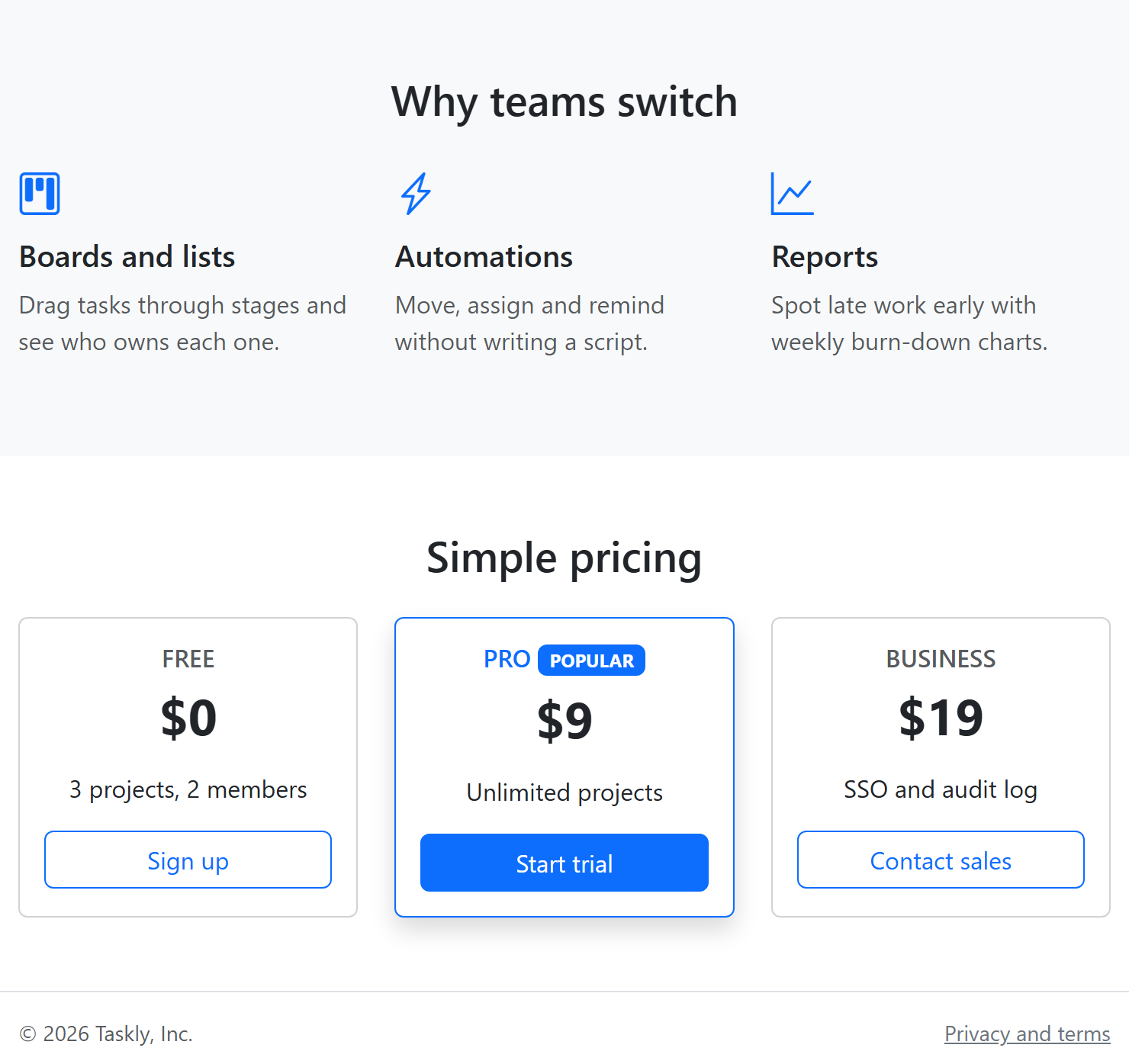
On a phone the navbar links fold behind the toggler and the hero buttons stack at full width; from 576 pixels the features and pricing cards sit three abreast. The design rests on a handful of decisions:
Mobile first. Unprefixed classes describe the phone layout; -sm- classes (navbar-expand-sm, row-cols-sm-3, d-sm-flex) add the wide one. Longer copy should wait for row-cols-md-3.
One container. .container-lg is 100% wide below 992 pixels, then caps at 960, 1140 or 1320 pixels.
Semantic structure. Landmark elements help screen readers, <section id> gives the menu anchor targets, and headings run h1, h2, h3 in order while .h5 and .h6 set their visual size.
Emphasis through utilities. The recommended plan gets border-primary, shadow and a badge; h-100 equalizes card heights. Theme-aware colors such as text-body-secondary let data-bs-theme="dark" produce a dark version (Colors and Dark Mode).
Tailwind CSS rebuilds this page with Tailwind CSS 5,202 , so keep these class lists at hand for comparison.
The admin dashboard
A dashboard packs the same parts more densely; Bootstrap's official Dashboard example (https://getbootstrap.com/docs/5.3/examples/dashboard/ 2,007 ) is a sound skeleton. The sidebar column (col-md-3 col-lg-2) wraps its links in an .offcanvas-md panel, a slide-in drawer below 768 pixels and an ordinary column above (Offcanvas), beside a <main class="col-md-9 ms-sm-auto col-lg-10"> area. Inside <main>, place a row of stat cards (row row-cols-2 row-cols-lg-4 g-3, each a .card with a large number and a label), a <canvas> chart drawn by Chart.js 38,651 , and a recent-orders table: .table.table-striped.table-sm wrapped in .table-responsive, which scrolls sideways on a phone instead of stretching the page.