Placeholders (Bootstrap 5.1 2,007 +) are gray blocks that stand in for content while it loads, a skeleton screen. Add .placeholder to an inline element and size it with .col-* or .w-*; .placeholder-lg, -sm and -xs change the height, and a parent with .placeholder-glow (pulsing) or .placeholder-wave (a sweeping highlight) animates them.
<link rel=stylesheet href="https://cdn.jsdelivr.net/npm/bootstrap@5.3.8/dist/css/bootstrap.min.css">
<div class="p-3 d-flex gap-3">
  <div class="card card-body w-50">
    <h5>Bootstrap 5.3</h5><p>HTML, CSS and JavaScript.</p>
    <a href="#" class="btn btn-primary align-self-start">Read more</a></div>
  <div class="card card-body w-50 placeholder-glow" aria-hidden="true">
    <h5><span class="placeholder col-9"></span></h5>
    <p><span class="placeholder col-7"></span> <span class="placeholder col-4"></span></p>
    <a class="btn btn-primary disabled placeholder col-5"></a></div>
</div>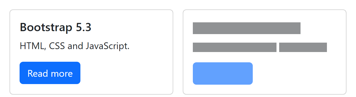
A placeholder is an inline-block of currentColor at 50% opacity with min-height: 1em, so it matches the text it replaces and the layout does not jump. Hide skeletons with aria-hidden="true".