A list group is a bordered stack of .list-group-item elements inside a .list-group. Add .list-group-item-action to <a> or <button> items for hover and focus states, .active with aria-current="true" for the selection, and disabled on buttons (.disabled with aria-disabled="true" on links).
<link rel="stylesheet"
  href="https://cdn.jsdelivr.net/npm/bootstrap@5.3.8/dist/css/bootstrap.min.css">
<div class="row g-4 p-3">
  <div class="col-6 list-group">
    <a href="#" class="list-group-item list-group-item-action active" aria-current="true">Inbox</a>
    <a href="#" class="list-group-item list-group-item-action d-flex justify-content-between">
      Drafts <span class="badge text-bg-primary rounded-pill">3</span></a>
    <button class="list-group-item list-group-item-action" disabled>Archive</button>
  </div>
  <ol class="col-6 list-group list-group-numbered list-group-flush">
    <li class="list-group-item">Install Node.js</li>
    <li class="list-group-item list-group-item-success">Run npm install</li>
    <li class="list-group-item list-group-item-warning">Fix the Sass warnings</li>
  </ol>
</div>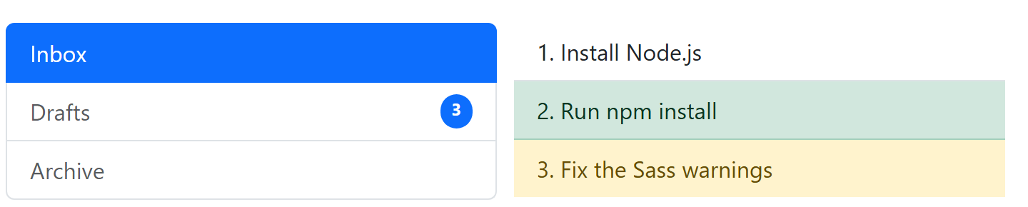
.list-group-flush removes the outer borders and corners for use inside cards, .list-group-numbered on an <ol> draws numbers with CSS counters, and .list-group-item-{color} tints items. .list-group-horizontal (or -sm to -xxl) lays items out in a row but cannot be combined with .list-group-flush. Items with data-bs-toggle="list" and an href to a .tab-pane drive the Tab plugin of Nav and Tabs, and .stretched-link on checkbox labels makes whole rows clickable.