Put .form-control on any text-like <input> or <textarea>. It makes the control block-level and full width, and adds a border, rounded corners and a blue box-shadow focus ring. Use .form-label on the label and .form-text for help text, linked through aria-describedby so screen readers announce it.
<link rel=stylesheet href="https://cdn.jsdelivr.net/npm/bootstrap@5.3.8/dist/css/bootstrap.min.css">
<form class="p-3">
  <label for="email" class="form-label">Email address</label>
  <input type="email" class="form-control" id="email" aria-describedby="emailHelp">
  <div id="emailHelp" class="form-text mb-2">We never share your email.</div>
  <div class="d-flex gap-2 mb-2 align-items-center">
    <input class="form-control form-control-lg" placeholder=".form-control-lg">
    <input class="form-control form-control-sm" placeholder=".form-control-sm">
    <input class="form-control" value="Disabled" disabled>
  </div>
  <input class="form-control-plaintext mb-1" readonly value="Plain text: user@example.com">
</form>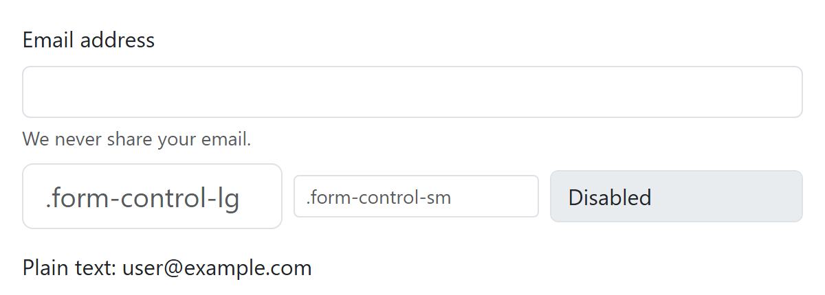
A readonly field can be focused and is submitted; a disabled one is grayed, skipped by Tab and not submitted. .form-control-plaintext strips the border from a read-only field so its value reads as ordinary text.