display: flex turns an element into a flex container whose children line up along one main axis, chosen by flex-direction (row, the default, column, or a -reverse variant); the perpendicular one is the cross axis. justify-* properties work on the main axis and align-* on the cross axis, so justify-content: center centers horizontally in a row but vertically in a column.
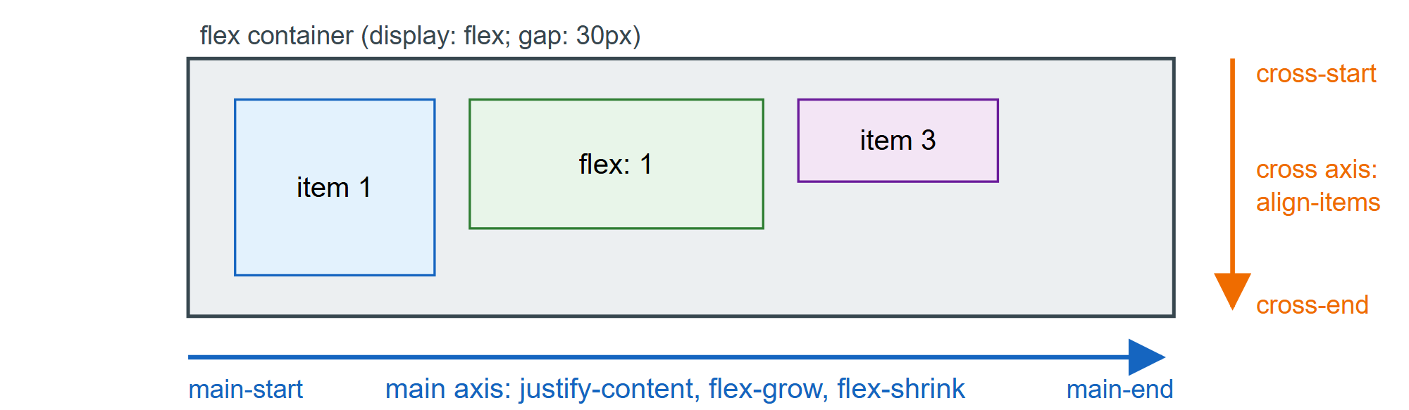
Each item starts at its flex-basis (auto means its width or content size). Leftover space is shared in proportion to flex-grow; on overflow, items give space back in proportion to flex-shrink times their basis. The flex shorthand sets all three: initial is 0 1 auto (the default), auto is 1 1 auto, none is 0 0 auto, and flex: 1 is 1 1 0, which ignores content size for equal shares. flex-wrap: wrap starts new lines that flex independently, and gap has replaced spacer margins in every major browser since 2021.
<style>
  body { font: 15px system-ui, sans-serif; margin: 12px; }
  nav, .cards { display: flex; gap: 10px; }
  nav { align-items: center; padding: 8px 12px; background: #37474f; color: #fff; }
  .login { margin-left: auto; }          /* an auto margin absorbs the free space */
  .cards { flex-wrap: wrap; margin-top: 10px; }
  .card { flex: 1 1 100px; padding: 8px; border: 2px solid #1565c0; background: #e3f2fd; }
  .wide { flex-grow: 2; }                /* twice the share of leftover space */
  .full { flex-basis: 100%; }            /* too wide for the row, so it wraps */
</style>
<nav><b>Shop</b><a>Deals</a><a>Help</a><span class="login">Log in</span></nav>
<div class="cards">
  <div class="card">flex: 1 1 100px</div><div class="card wide">flex-grow: 2</div>
  <div class="card">Third</div><div class="card full">flex-basis: 100% wraps</div>
</div>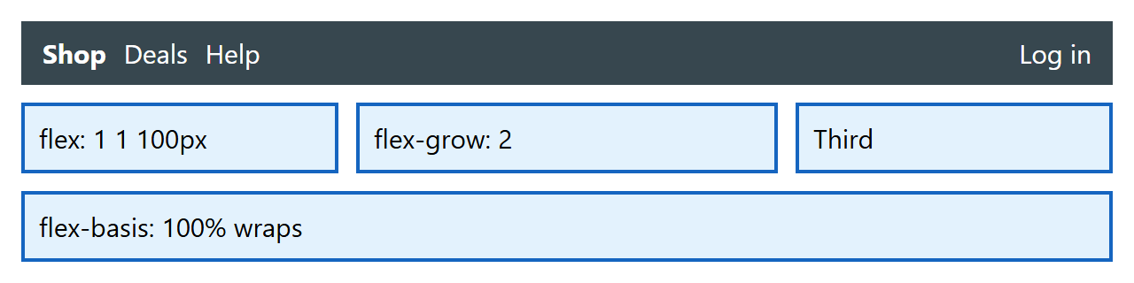
Two pitfalls: flex items default to min-width: auto, so a long URL refuses to shrink and overflows (add min-width: 0), and order or row-reverse change only the visual order, not focus or screen-reader order. Use Flexbox for one-dimensional runs such as toolbars and centering, and Grid when rows and columns must align. Bootstrap 2,007 's .d-flex utilities and row/column system (Grid Layout) are built on these properties.