The engine sizes its drawing buffer at creation, so call engine.resize() whenever the canvas's CSS size changes; otherwise the image stretches. adaptToDeviceRatio multiplies the size by devicePixelRatio, as Resizing the Context did by hand. These canvases differ only in that flag, captured at a pixel ratio of 2:
<style>canvas { width: 228px; height: 170px; margin-right: 4px }</style>
<canvas id="blurry"></canvas><canvas id="sharp"></canvas>
<script src="https://cdn.jsdelivr.net/npm/babylonjs@9.28.0/babylon.js"></script>
<script>
for (const [canvas, adapt] of [[blurry, false], [sharp, true]]) {
  const engine = new BABYLON.Engine(canvas, true, {}, adapt);
  const scene = new BABYLON.Scene(engine);
  scene.clearColor = BABYLON.Color4.FromHexString('#eceff1ff');
  BABYLON.MeshBuilder.CreateTorusKnot('knot', { tube: 0.15, radialSegments: 256 }, scene);
  scene.createDefaultCameraOrLight(true, true, false);  // camera framing the knot, light
  new ResizeObserver(() => engine.resize()).observe(canvas);
  scene.executeWhenReady(() => engine.runRenderLoop(() => scene.render()));
  scene.onAfterRenderObservable.add(() => { window.__done = scene.getFrameId() > 3; });
}
</script>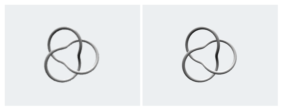
The left engine renders 228 x 170 pixels, which the browser stretches over 456 x 340 device pixels, so its edges blur. Babylon 89,603 stores the ratio's inverse as a hardware scaling level (1 and 0.5 here); on a weak GPU, engine.setHardwareScalingLevel(1) draws a phone's 3x screen at CSS resolution, a ninth of the pixels. A ResizeObserver also catches layout changes that resize events miss.