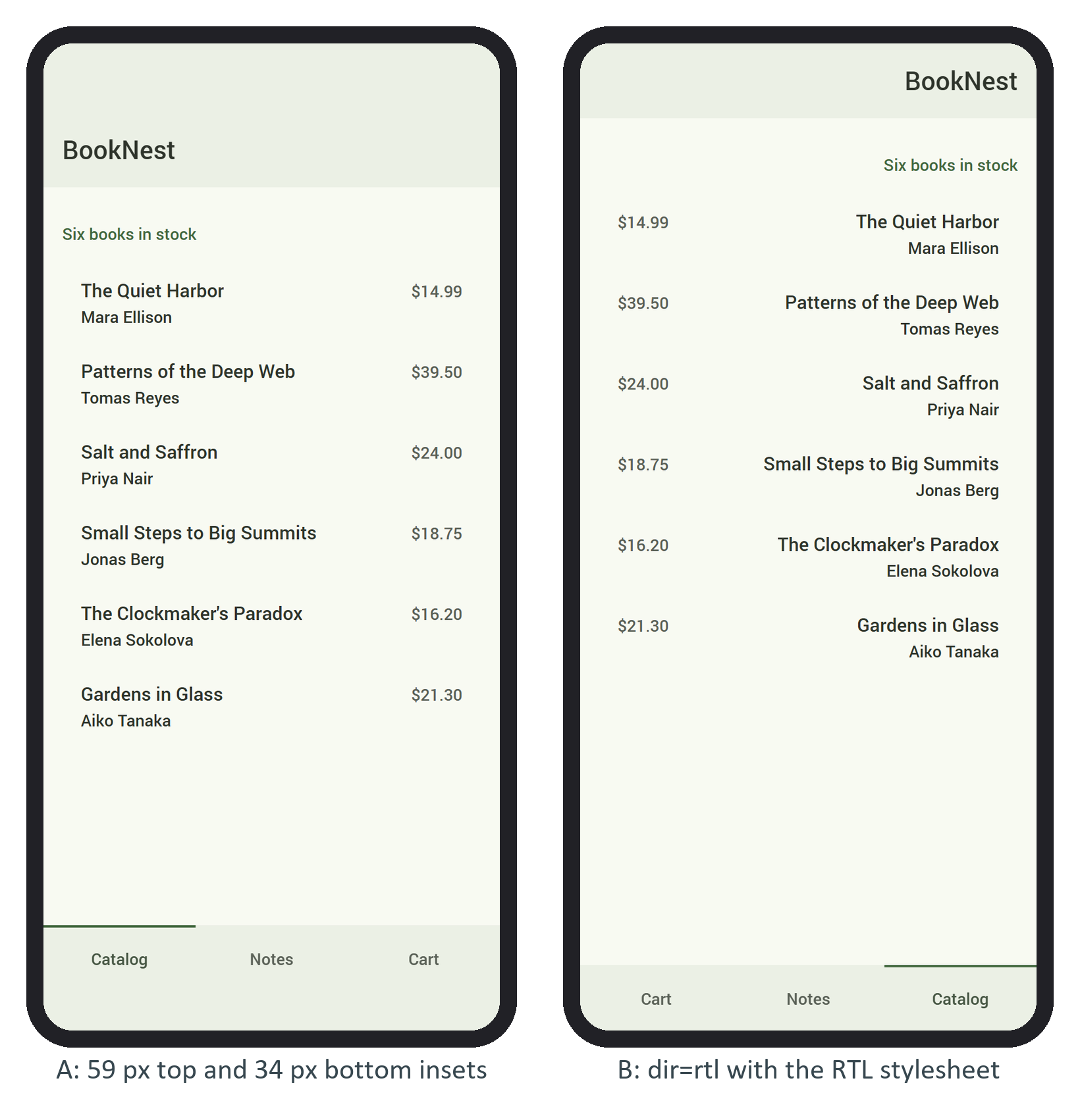
Camera cutouts, rounded corners and gesture bars cover parts of a phone's viewport. Browsers report them as env(safe-area-inset-top), -right, -bottom and -left (Baseline widely available) once the page opts in with viewport-fit=cover in its viewport meta tag; from Chrome 135 1 that includes Android's gesture bar.
Framework7 572,986 copies the insets into its own variables. --f7-safe-area-top and --f7-safe-area-bottom are set on :root, so navbars, toolbars and toasts pad themselves. Side insets matter in landscape and apply only to elements you mark: safe-areas for one touching both side edges (BookNest's main view), safe-area-left or -right for one edge, and no-safe-area-left/-right to cancel them. Popups, sheets and panels need no class.
To test without an iPhone, send Chrome's experimental DevTools command that sets the real env() values:
from playwright.sync_api import sync_playwright
with sync_playwright() as p:
    browser = p.chromium.launch(channel='chrome')
    page = browser.new_page(viewport={'width': 390, 'height': 844}, device_scale_factor=2)
    cdp = page.context.new_cdp_session(page)
    cdp.send('Emulation.setSafeAreaInsetsOverride', {'insets': {'top': 59, 'bottom': 34}})
    page.goto('http://localhost:5291/')
    page.wait_for_timeout(1500)
    print(page.evaluate("document.querySelector('.navbar').offsetHeight"))
page.screenshot(path='notch.png')123
The Material navbar grew from 64 to 123 pixels, exactly the 59-pixel inset, and the tab bar gained 34 pixels (panel A below). Position your own fixed elements with the same variables, never a hard-coded status-bar height.