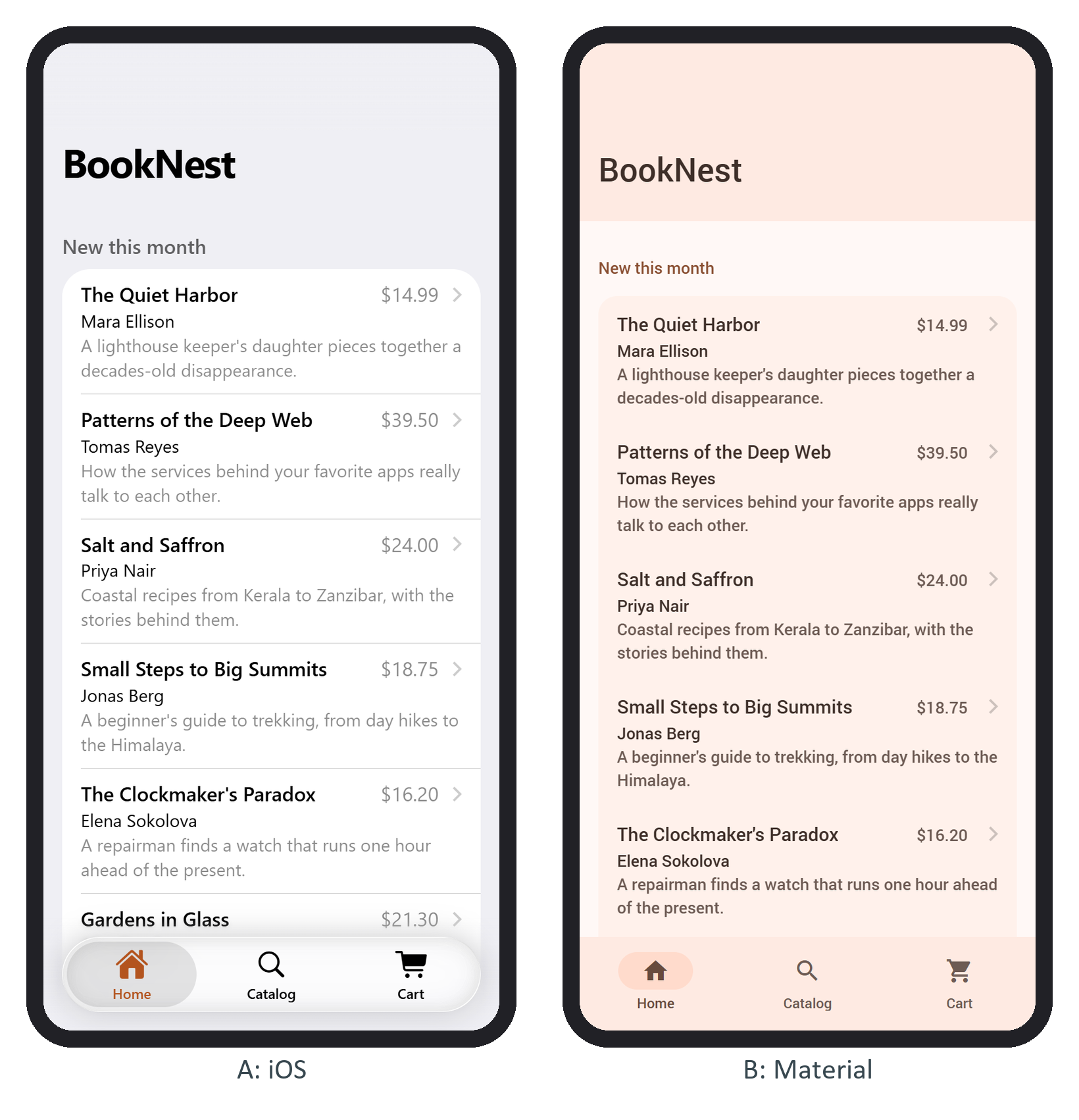
A navbar is a .navbar holding an empty .navbar-bg (the background, animated separately during transitions) and a .navbar-inner with up to three children: .left for the back link, .title, and .right for actions. The sliding class makes elements slide rather than fade between pages. Two v9 changes break older tutorials: dynamicNavbar is gone, and the back link is an icon without the word "Back" (<a href="#" class="link back"><i class="icon icon-back"></i></a>; add a <span> for text).
A large title is the big heading iOS apps show above their content. Add navbar-large and a .title-large block, as BookNest's home page does:
<div class="navbar navbar-large">
  <div class="navbar-bg"></div>
  <div class="navbar-inner">
    <div class="title sliding">BookNest</div>
    <div class="title-large">
      <div class="title-large-text">BookNest</div>
    </div>
  </div>
</div>
Scroll past the large title and Framework7 572,986 adds navbar-large-collapsed and fires page:navbarlargecollapsed; the collapseLargeTitleOnScroll and snapPageScrollToLargeTitle app parameters default to true, so a half-collapsed title snaps open or shut. This DevTools console snippet (top-level await works there) prints whether the bar collapsed and the bottom edges of the bar and the large title, in pixels, before and after scrolling. It was run at 390x844 under an iPhone and then an Android user agent:
const c = document.querySelector('#view-home .page-content');
const n = document.querySelector('#view-home .navbar');
const edge = (s) => Math.round(n.querySelector(s).getBoundingClientRect().bottom);
const theme = document.documentElement.classList.contains('ios') ? 'ios' : 'md';
for (const y of [0, 300]) {
  c.scrollTop = y;
  await new Promise((r) => setTimeout(r, 600));
  console.log(theme, y, n.classList.contains('navbar-large-collapsed'),
    edge('.navbar-bg'), edge('.title-large-text'));
}ios 0 false 76 128 ios 300 true 76 76 md 0 false 152 133 md 300 true 64 45
Material shrinks the bar from 152 to 64 pixels, like Jetpack Compose 234 's large top app bar (Android with Kotlin). The iOS 26 bar stays 76 pixels tall with no fill: the large title slides up under the small centered one.