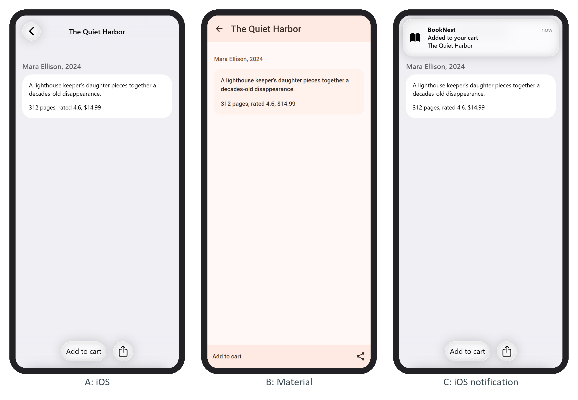
A toolbar is a .toolbar with a .toolbar-inner of links; a tab bar adds the tabbar class, and tabbar-icons for icons above labels. Framework7 v9 572,986 adds toolbar panes (.toolbar-pane) for the iOS 26 design: on iOS each pane becomes one glass capsule, while Material lays the links out flat. BookNest's book page uses two panes:
<div class="toolbar toolbar-bottom">
  <div class="toolbar-inner">
    <div class="toolbar-pane">
      <a href="#" class="link" @click=${add}>Add to cart</a>
    </div>
    <div class="toolbar-pane">
      <a href="#" class="link icon-only">
        <i class="icon f7-icons if-not-md">square_arrow_up</i>
        <i class="icon material-icons if-md">share</i>
      </a>
    </div>
  </div>
</div>
if-not-md and if-md show one icon font per theme. Placement decides ownership: a toolbar inside a .page leaves with that page, one in a .view is shared by its pages, and one in .views spans all views, like a tab bar. toolbar-top or toolbar-bottom picks the edge, and hide-toolbar-on-scroll on .page-content hides it while the user scrolls down. The book page is a page no-toolbar, so the tab bar slides away while the page's own toolbar is on screen (panels A and B).