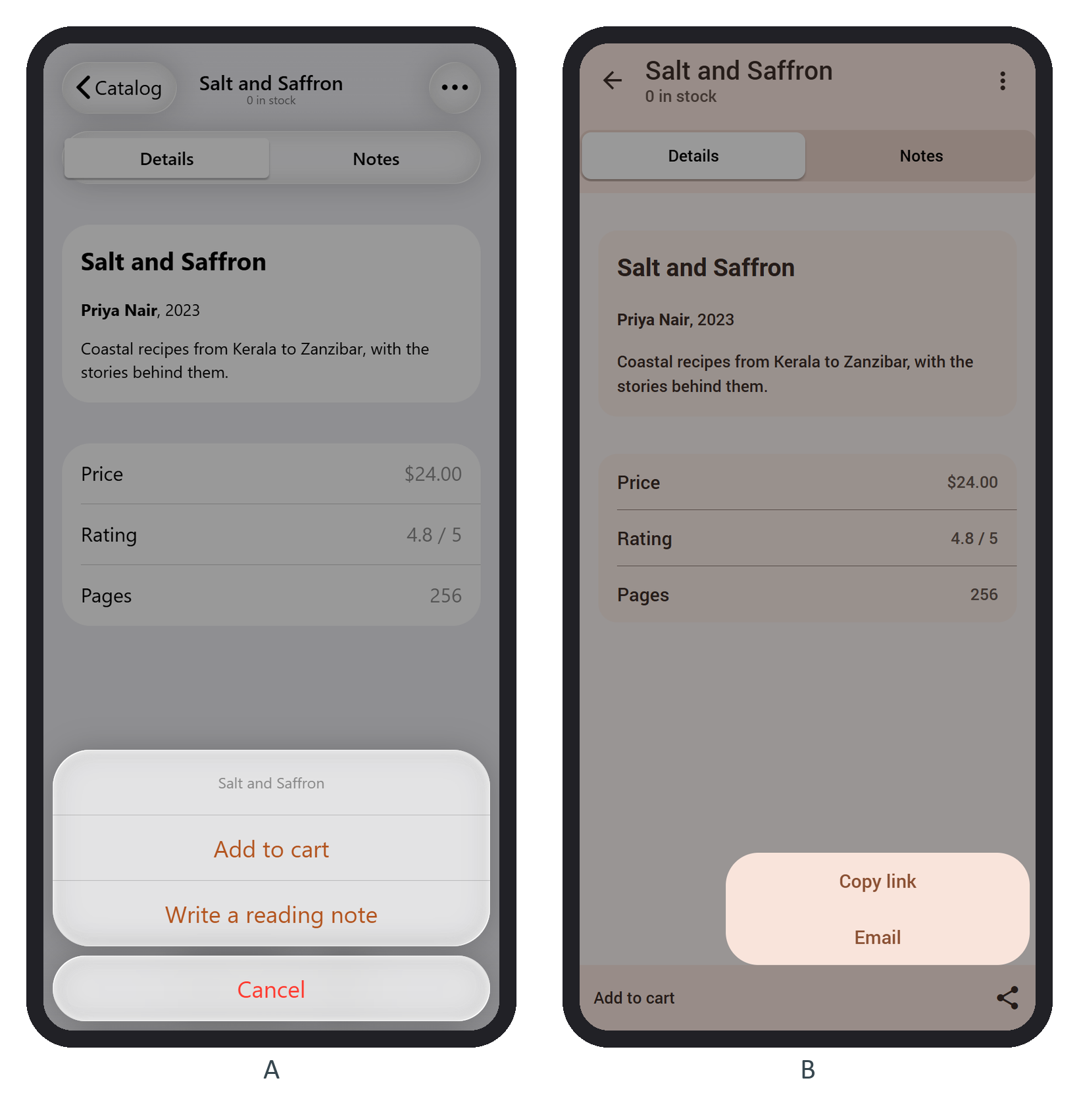
An action sheet slides buttons up from the bottom edge, for a choice about the current item. The book page's menu from pageInit now has two groups, the first headed by a label:
      sheet = $f7.actions.create({
        buttons: [
          [
            { text: book.title, label: true },
            { text: 'Add to cart', bold: true, onClick: add },
            { text: 'Write a reading note', onClick: () => $f7router.navigate('/note/') },
          ],
          [{ text: 'Cancel', color: 'red' }],
        ],
      });
convertToPopover (default true) shows the same Actions as a popover when you pass targetEl and the app is at least 768 px wide or runs on an iPad or desktop.
A popover is a small bubble anchored to an element. The share button creates one per tap with app.popover.create({ targetEl: e.currentTarget, content }); its Copy link item writes https://example.com/books/3/ with the Clipboard API and shows a toast. Framework7 572,986 removes a modal built from a content string when it closes. A first version also called popover.destroy() on closed, and after three taps three orphaned popovers were left in the DOM; without it, none were. On a device, prefer navigator.share(), the system share sheet, where it exists.