The catalog is a grid of raised cards, each linking to the detail route of Routes and Navigation and showing the cover, title, author, price, rating and a stock badge. The heart of src/pages/catalog.f7:
<div class="grid grid-cols-2 medium-grid-cols-3 large-grid-cols-6 grid-gap">
  ${loading ? skeletons() : books.value.map((b) => $h`
    <a href="/books/${b.id}/" class="card card-raised book-card">
      <div class="cover" style="--hue: ${hue(b)}">${b.title}</div>
      <div class="card-content card-content-padding">
        <div class="book-title">${b.title}</div>
        <div class="book-author">${b.author}</div>
        <div class="book-meta"><b>${price(b)}</b> · ★ ${b.rating}</div>
        <span class="badge ${b.inStock ? 'color-green' : 'color-red'}">
          ${b.inStock ? 'In stock' : 'Sold out'}</span>
      </div>
    </a>`)}
</div>
One rule in app.css makes the <a> behave as a grid cell, .book-card { display: block; margin: 0; overflow: hidden; color: inherit; }. A card's default margin would double the grid's gap, and overflow: hidden clips the square cover corners to the card's rounded ones (24 px on iOS, 16 px on Material).
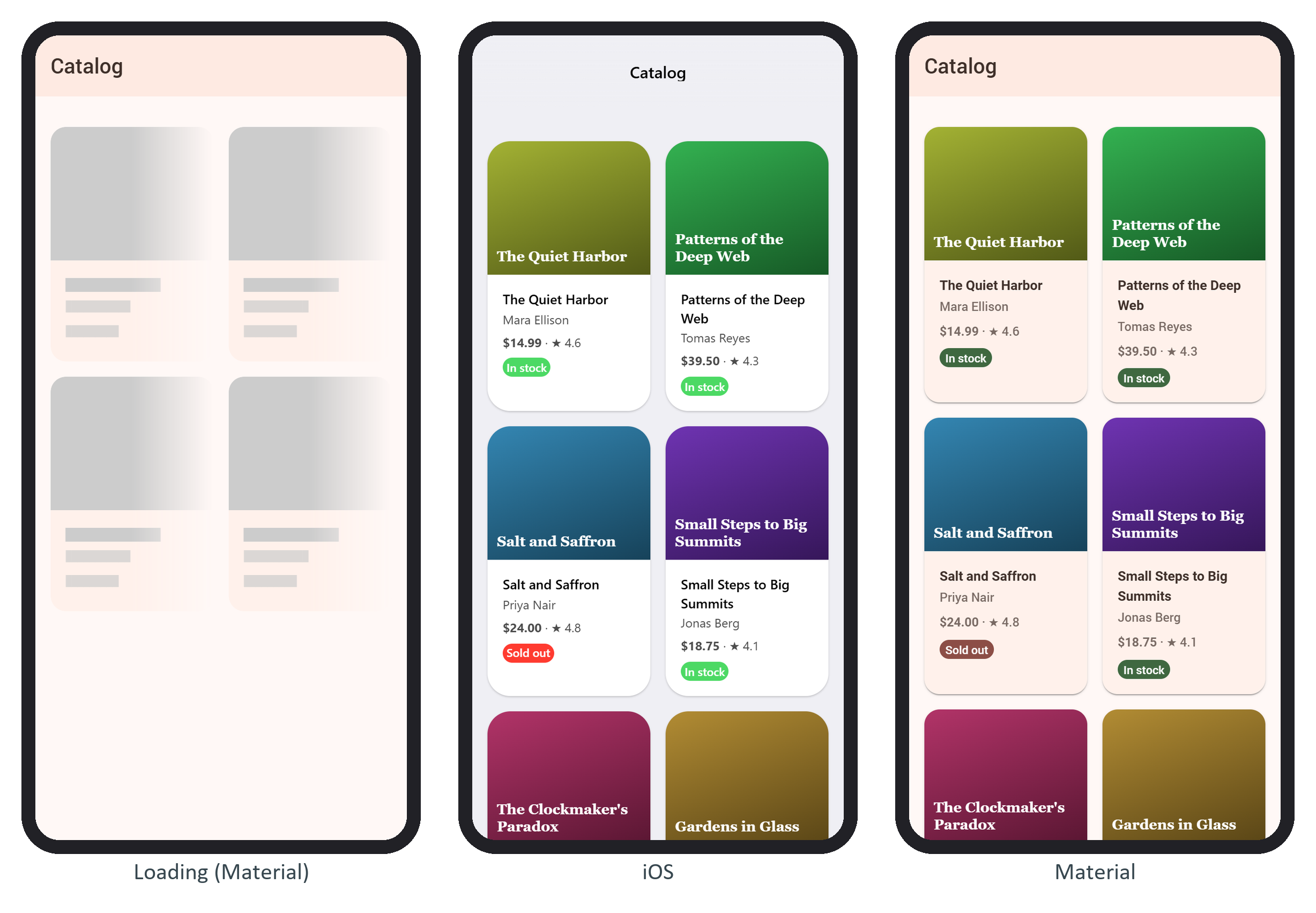
In Material, the color-green and color-red badges came out darker and muted.