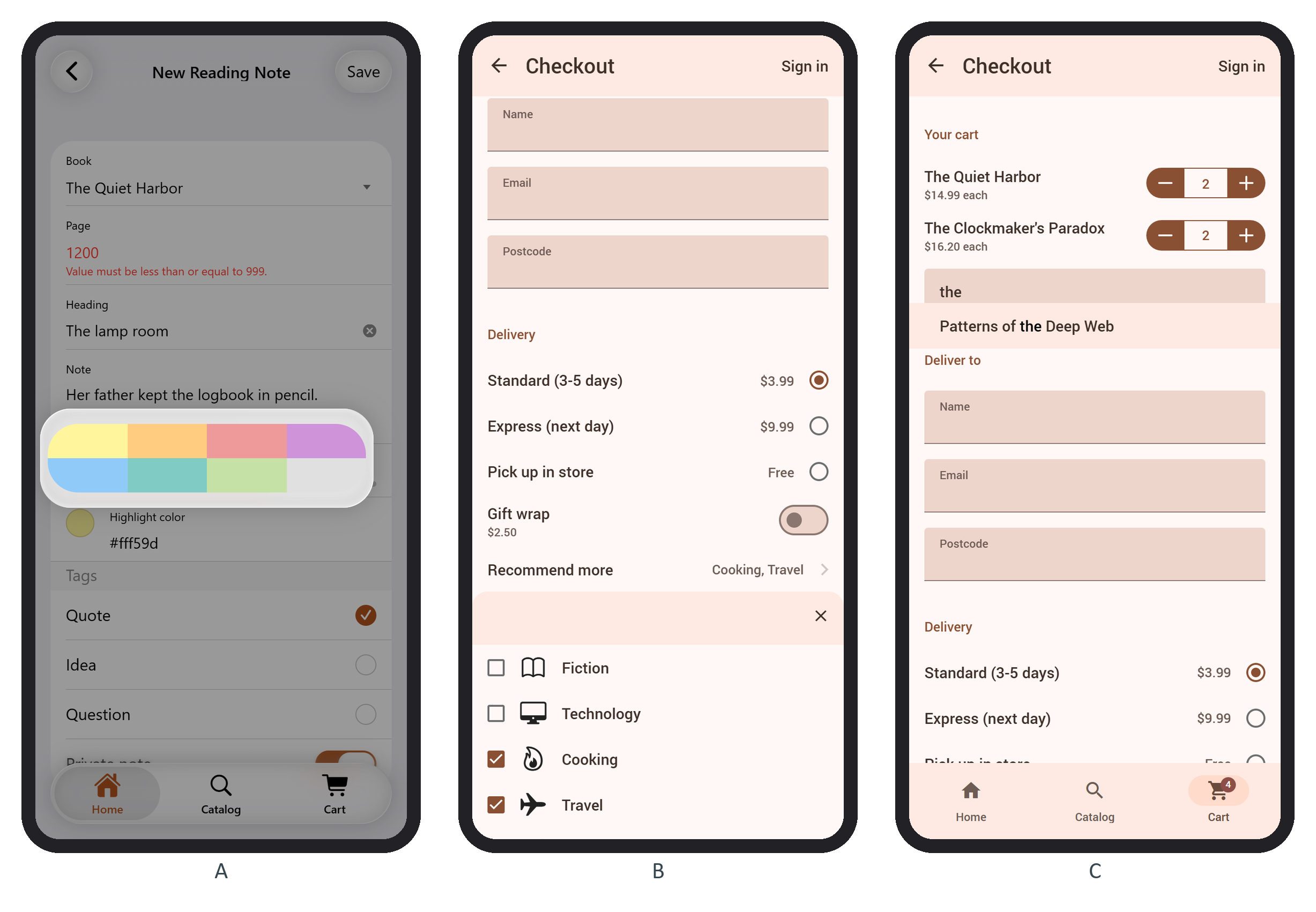
A smart select hides a native <select> and shows its options as a list of checkboxes, or radios for a single choice, in a page, popup, sheet or popover (openIn, default 'page'). The row shows the chosen values, and the hidden <select> stays the source of truth for the form:
            <a class="item-link smart-select smart-select-init" data-open-in="sheet"
              data-page-title="Recommend books from">
              <select name="genres" multiple>
                ${genres.map((g) => $h`
                  <option value="${g.name}" data-option-icon="f7:${g.icon}">${g.name}</option>`)}
              </select>
              <div class="item-content"><div class="item-inner">
                <div class="item-title">Recommend more</div>
              </div></div>
            </a>
data-option-icon="f7:flame" adds a Framework7 Icons 230 glyph (material: names a Material icon). Choosing Cooking and Travel set the row to "Cooking, Travel" and stored "genres":["Cooking","Travel"] (B below). Add data-searchbar="true" to long lists.