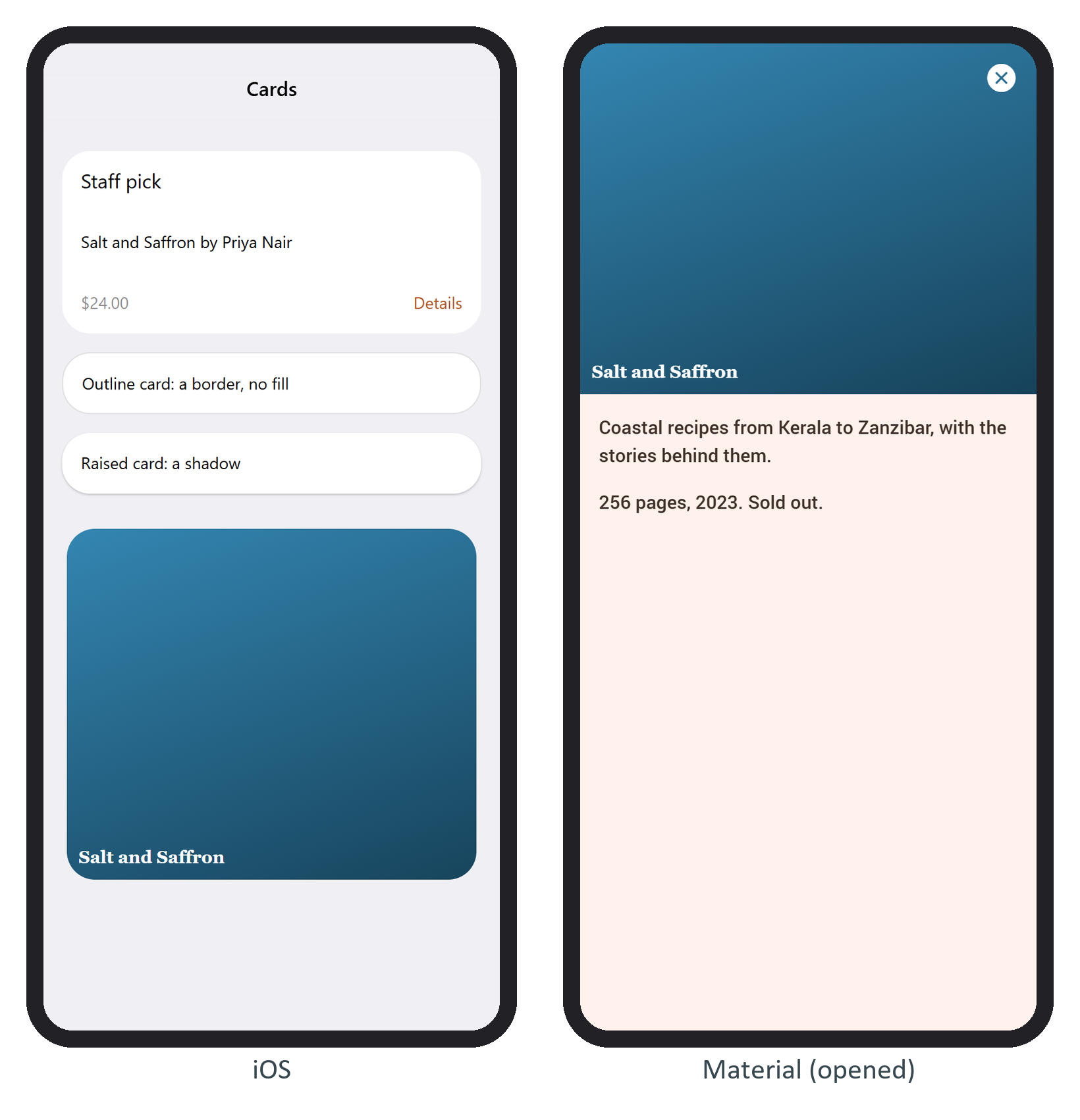
A card is a .card with an optional card-header, a required card-content (card-content-padding adds spacing) and an optional card-footer, a flex row that pushes its children to both ends. card-outline draws a border and card-raised a shadow. An expandable card grows to fill the screen when tapped:
<div class="card card-expandable">
  <div class="card-content">
    <div class="cover" style="--hue: ${hue(pick)}; height: 280px">${pick.title}</div>
    <a class="link card-close card-opened-fade-in" style="position: absolute; right: 16px;
      top: 16px; color: #fff"><i class="icon f7-icons">xmark_circle_fill</i></a>
    <div class="card-content-padding">
      <p>${pick.summary}</p>
card-opened-fade-in hides the close button until the card opens and card-close closes it. Code can call app.card.open(el) and listen for card:opened and card:closed. By default an open card hides the navbar, toolbar and statusbar, shows a backdrop, and closes on a swipe down or a backdrop tap.