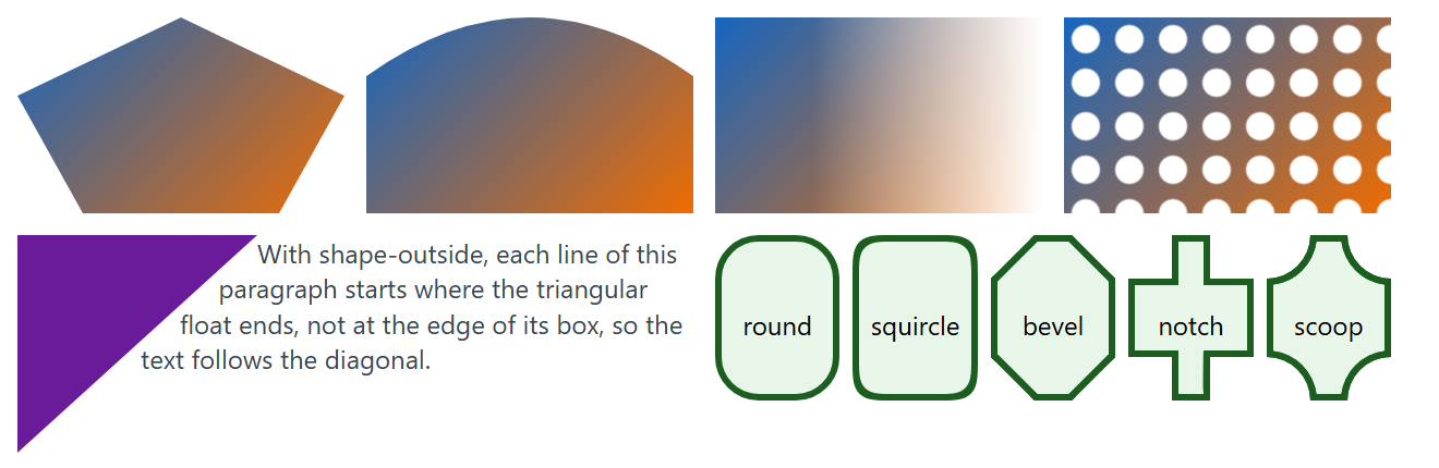
clip-path shows only the pixels inside a shape: inset(10px round 20px), circle(40%), ellipse(), polygon(50% 0, 100% 100%, 0 100%), path() with SVG path data in pixels, shape() (Baseline 2026), whose path commands accept percentages so the shape scales, or url(#id) for an SVG <clipPath>. The edge is hard, clipped-out areas stop receiving clicks, and layout still sees the full rectangle.
mask-image is the soft version: the mask's alpha sets each pixel's opacity, so gradients make fades and images make stencils. The other mask-* longhands mirror the background ones, and mask-composite combines layers with add, subtract, intersect or exclude. Unprefixed masks became Baseline widely available in June 2026; mask-border still works only in Safari 10 .
shape-outside changes how inline content wraps around a float, not how the float looks. It takes a basic shape, a box keyword or an image (cut at shape-image-threshold), padded by shape-margin.
corner-shape is experimental: only Chrome 1 and Edge 139+ ship it, Safari has it in Technology Preview, and Firefox 555 has not implemented it. It redraws the curve inside an existing border-radius as round (default), squircle, bevel, notch, scoop, square or superellipse(k); other browsers show round corners.
<style>
  body { display: grid; grid-template-columns: repeat(4, 150px); gap: 10px; margin: 8px;
    font: 12px/1.35 system-ui; }
  .t { height: 90px; background: linear-gradient(135deg, #1565c0, #ef6c00); }
  .poly { clip-path: polygon(50% 0, 100% 40%, 80% 100%, 20% 100%, 0 40%); }
  .wave {
    clip-path: shape(from 0 30%, curve to 100% 30% with 50% -30%, vline to 100%, hline to 0);
  }
  .fade { mask-image: linear-gradient(90deg, #000 30%, #0000); }
  .holes { mask: radial-gradient(#0000 6px, #000 7px) 0 0 / 20px 20px; }
  .wrap { grid-column: span 2; margin: 0; color: #37474f; }
  .wrap i { float: left; width: 110px; height: 100px; background: #6a1b9a;
    clip-path: polygon(0 0, 100% 0, 0 100%); shape-outside: polygon(0 0, 100% 0, 0 100%); }
  .corners { grid-column: span 2; display: flex; gap: 6px; text-align: center; }
  .corners b { flex: 1; padding-top: 30px; height: 40px; border: 3px solid #1b5e20;
    border-radius: 20px; background: #e8f5e9; font-weight: normal; }
</style>
<div class="t poly"></div> <div class="t wave"></div>
<div class="t fade"></div> <div class="t holes"></div>
<p class="wrap"><i></i>With shape-outside, each line of this paragraph starts where the
  triangular float ends, not at the edge of its box, so the text follows the diagonal.</p>
<div class="corners"><b>round</b><b style="corner-shape: squircle">squircle</b>
  <b style="corner-shape: bevel">bevel</b><b style="corner-shape: notch">notch</b>
  <b style="corner-shape: scoop">scoop</b></div>