Beyond the basics in Image Values, gradients get their power from color stops and tiling:
Stops and hints. red 20% 40% gives a solid band; a bare percentage between two colors (red, 30%, blue) is a hint that moves the midpoint; a stop at 0 after another stop makes a hard edge.
Sizing and angles. radial-gradient(circle closest-side at 30%, ...) ends at the nearest edge (farthest-corner is the default); conic-gradient(from 90deg, ...) stops run around the center.
Tiles. A gradient has no intrinsic size, so background-size turns it into a repeating tile, and layered tiles make patterns.
Color space. in oklch longer hue, red, red travels the long way around the hue wheel, a rainbow from one color (Baseline 2024).
<style>
  body { display: grid; grid-template-columns: repeat(4, minmax(0, 1fr)); gap: 0 10px; margin: 8px;
    font: 12px system-ui; }
  p { position: relative; height: 56px; margin: 0 0 20px; outline: 1px solid #cfd8dc; }
  p::after { content: attr(data-l); position: absolute; top: 100%; left: 0; white-space: nowrap;
    font: 12px system-ui; color: #000; }
</style>
<p data-l="hint at 15%" style="background: linear-gradient(90deg, #1565c0, 15%, #ef6c00)"></p>
<p data-l="closest-side"
  style="background: radial-gradient(circle closest-side at 30%, #fff176, #37474f)"></p>
<p data-l="conic pie chart" style="width: 56px; border-radius: 50%;
  background: conic-gradient(#1565c0 0 45%, #2e7d32 0 70%, #ef6c00 0)"></p>
<p data-l="checkerboard tile"
  style="background: repeating-conic-gradient(#37474f 0 25%, #fff 0 50%) 0 0 / 20px 20px"></p>
<p data-l="grid paper: two layers" style="background: linear-gradient(#90caf9 1px, #0000 0)
  0 0 / 100% 12px, linear-gradient(90deg, #90caf9 1px, #fff 0) 0 0 / 12px 100%"></p>
<p data-l="background-clip: text" style="font: 900 34px/56px system-ui; color: #0000; outline: 0;
  background: linear-gradient(90deg, #6a1b9a, #ef6c00); background-clip: text">Gradient</p>
<p data-l="in oklch longer hue"
  style="background: linear-gradient(90deg in oklch longer hue, red, red)"></p>
<p data-l="gradient border" style="border: 6px solid #0000; border-radius: 12px; outline: 0;
  background: linear-gradient(#fff 0 0) padding-box, linear-gradient(90deg, #6a1b9a, #ef6c00)
  border-box"></p>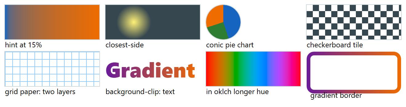
The gradient border paints white over the padding box and a gradient under the transparent border; unlike border-image, it respects border-radius.