| Unit | Relative to | Baseline |
|---|---|---|
| %, em, rem | parent measurement, element font size, root font size | Widely available |
| ex ch cap ic lh (rlh) | font metrics, line height (of the root) | Widely available |
| rex rch rcap ric | root-font metrics | Newly available (2026) |
| vw vh vmin vmax, sv* lv* dv* | 1% of the viewport (small, large, dynamic) | Widely available |
| cqw cqh cqi cqb cqmin cqmax | 1% of the query container | Widely available |
An em on font-size multiplies the parent's font size, so three nested levels of 1.2em give 1.728 times the base. rem always refers to the root, the safer unit for type scales; keep em for things that track the element's own text, such as a button's padding.
<style>
  body { font: 16px sans-serif; margin: 8px; }
  .em  { font-size: 1.2em; border-left: 4px solid #ef6c00; padding-left: 6px; }
  .rem { font-size: 1.2rem; border-left: 4px solid #2e7d32; padding-left: 6px; }
  .card { container-type: inline-size; background: #e3f2fd; margin-top: 10px; padding: 6px; }
  .card h2 { font-size: 8cqi; margin: 0; }
</style>
<div class="em">1.2em<div class="em">1.2em<div class="em">1.2em (27.6px)</div></div></div>
<div class="rem">1.2rem<div class="rem">1.2rem<div class="rem">1.2rem (19.2px)</div></div></div>
<div class="card" style="width: 320px"><h2>8cqi: 320px card</h2></div>
<div class="card" style="width: 200px"><h2>8cqi: 200px card</h2></div>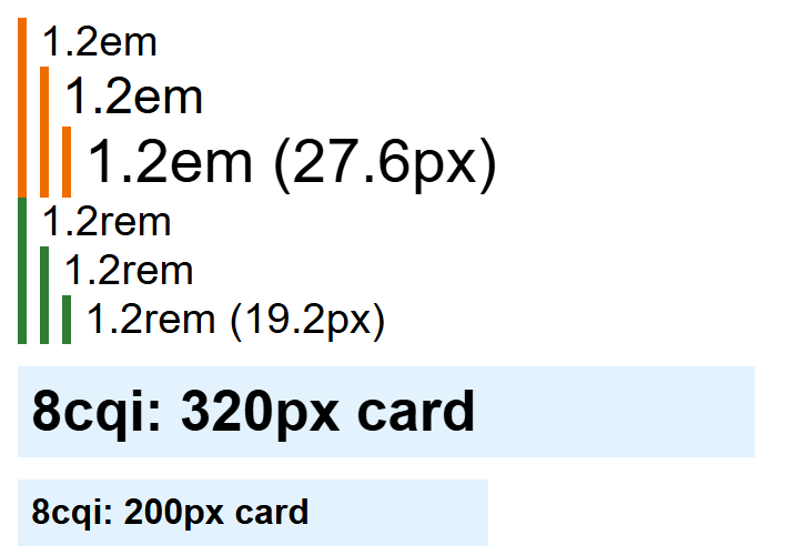
Mobile toolbars slide away as you scroll, so svh uses the small viewport (toolbars shown), lvh the large one and dvh the current state. Plain vh equals lvh, so a height: 100vh hero hides its bottom edge behind the toolbar. Prefer min-height: 100svh; dvh makes content jump as the toolbar moves. Container units measure the nearest ancestor with container-type (Container Queries) and fall back to small viewport units when there is none.