display: grid sizes rows and columns together, so items in different rows line up. grid-template-columns and grid-template-rows define tracks separated by numbered lines: three columns have lines 1 to 4, or -4 to -1 counted from the end. Items flow into free cells (grid-auto-flow: dense backfills holes) or sit on lines, as in grid-column: 1 / -1 (full width) or grid-row: 2 / span 3. Tracks accept fr (a share of leftover space), minmax(12rem, 1fr) and repeat(auto-fit, minmax(12rem, 1fr)), which fits as many columns as possible without a media query (auto-fill keeps empty tracks; auto-fit collapses them). grid-template-areas names regions with ASCII art.
<style>
  body { font: 14px system-ui, sans-serif; margin: 10px; }
  .page { display: grid; gap: 8px; grid-template: auto 1fr auto / 130px 1fr;
          grid-template-areas: "head head" "side main" "foot foot"; }
  .page > * { background: #eceff1; border: 2px solid #37474f; padding: 6px; }
  header { grid-area: head; } aside { grid-area: side; }
  main { grid-area: main; } footer { grid-area: foot; }
  .tiles { display: grid; gap: 6px; grid-template-columns: repeat(auto-fit, minmax(90px, 1fr)); }
  .tiles div { background: #e3f2fd; border: 1px solid #1565c0; padding: 6px; }
  .tiles .wide { grid-column: span 2; background: #fff3e0; }
</style>
<div class="page"><header>header (grid-area: head)</header><aside>aside: 130px</aside>
  <main><div class="tiles"><div class="wide">span 2</div><div>2</div><div>3</div><div>4</div>
    <div>5</div><div>6</div></div></main><footer>footer spans both columns</footer></div>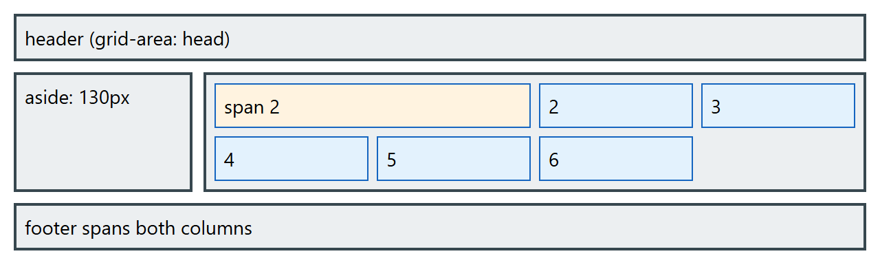
Subgrid
A nested grid normally has its own tracks, so sibling cards cannot align their titles and buttons. grid-template-rows: subgrid (or -columns) makes a child reuse the parent tracks it spans. Subgrid became Baseline in September 2023 (Chrome 117 1 , Firefox 71 555 , Safari 16 10 ) and is now widely available.
<style>
  body { font: 14px system-ui, sans-serif; margin: 10px; }
  .cards { display: grid; grid-template-columns: repeat(3, 1fr); column-gap: 10px; }
  .card { display: grid; grid-row: span 3; grid-template-rows: subgrid; row-gap: 4px;
          padding: 8px; background: #e8f5e9; border: 2px solid #2e7d32; }
  h4, p { margin: 0; } button { justify-self: start; }
</style>
<div class="cards">
  <div class="card"><h4>Starter</h4><p>One site.</p><button>Buy</button></div>
  <div class="card"><h4>Team plan, longer name</h4><p>Five sites, shared billing and priority
    support.</p><button>Buy</button></div>
  <div class="card"><h4>Agency</h4><p>Unlimited sites.</p><button>Buy</button></div>
</div>
Masonry: Grid Lanes
Masonry (Pinterest-style) layout keeps strict columns but packs items of different heights upward. After years of competing proposals, including grid-template-rows: masonry and display: masonry, the CSS Working Group chose a new display value in CSS Grid Level 3: display: grid-lanes. It reuses the track syntax, so display: grid-lanes; grid-template-columns: repeat(auto-fill, minmax(14rem, 1fr)) is a complete gallery; each item goes into the lane where it sits closest to the start. MDN 102 marks it experimental: it shipped in Safari 26.4 (March 2026), Chrome and Edge have offered it behind a flag since version 140, and Firefox has not shipped it. Declare an ordinary grid first and switch inside @supports (display: grid-lanes).