CSS has one global namespace and a cascade that rewards whoever wrote the last, most specific rule. Architectures fight the two failure modes this causes: class names that collide, and specificity wars that end in !important.
| Method | Origin | Core rule |
|---|---|---|
| BEM | Yandex, 2000s | block__element--modifier, one class per selector |
| OOCSS | Nicole Sullivan | Separate structure from skin, container from content |
| SMACSS | Jonathan Snook | Base, Layout, Module, State (is-open), Theme |
| ITCSS | Harry Roberts | Layers from generic to specific: Settings to Utilities |
| CUBE CSS | Andy Bell | Composition, Utility, Block, Exception; embrace the cascade |
| Utility-first | Atomic CSS, Tailwind 5,202 | One declaration per class, composed in markup |
ITCSS orders files so specificity only rises: Settings and Tools (variables, mixins, no output), Generic (resets), Elements (bare h1, a), Objects (layout patterns), Components, Utilities. Native @layer (@layer and @scope) now enforces that order in the browser, whatever order the files load in. CUBE CSS leans on global styles and layout "compositions" and writes block CSS only for what remains.
Here is one pricing card written in BEM. Every selector is a single class, so specificity stays at 0-1-0 and a modifier wins simply by coming later in the file.
<style>
  .card { width: 240px; padding: 16px; border: 1px solid #cfd8dc; border-radius: 8px;
    font-family: system-ui; }
  .card--featured { border-color: #1565c0; box-shadow: 0 4px 12px rgb(21 101 192 / 0.25); }
  .card__title { margin: 0 0 4px; font-size: 1.125rem; }
  .card__price { margin: 0; color: #546e7a; }
  .card__button { margin-top: 12px; padding: 6px 14px; border: 0; border-radius: 6px;
    background: #1565c0; color: #fff; font: inherit; }
</style>
<div style="display: flex; gap: 16px">
  <article class="card">
    <h3 class="card__title">Basic</h3><p class="card__price">Free</p>
    <button class="card__button">Choose</button>
  </article>
  <article class="card card--featured">
    <h3 class="card__title">Pro</h3><p class="card__price">$12 per month</p>
    <button class="card__button">Choose</button>
  </article>
</div>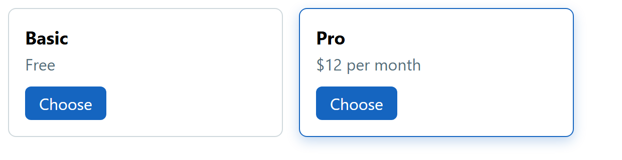
The utility-first version moves every decision into the markup and needs no stylesheet of its own; Tailwind CSS generates the classes (Tailwind CSS).
<article class="w-60 rounded-lg border border-blue-700 p-4 shadow-lg shadow-blue-700/25">
  <h3 class="mb-1 text-lg font-semibold">Pro</h3>
  <p class="text-slate-600">$12 per month</p>
  <button class="mt-3 rounded-md bg-blue-700 px-3.5 py-1.5 text-white">Choose</button>
</article>
BEM keeps HTML readable, but naming takes discipline and dead CSS accumulates. Utilities never collide or go dead, but markup gets long, so extract repeated patterns into components. Most teams mix them: tokens and a few BEM or CUBE blocks for complex widgets, utilities for spacing and layout.