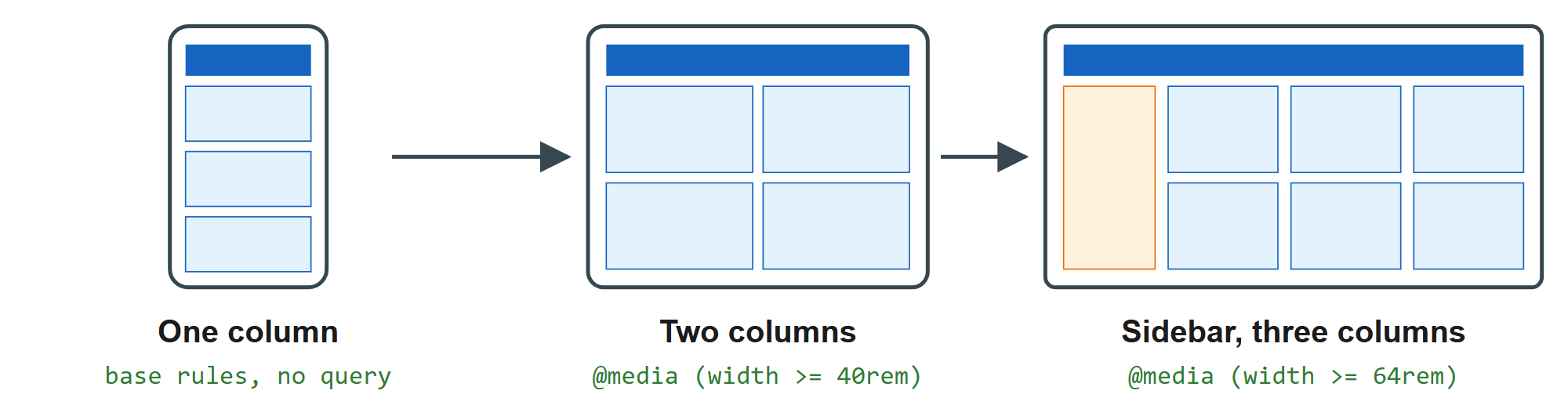
A responsive page adapts one HTML document to every screen, from a 360-pixel phone to a 2,560-pixel monitor. Ethan Marcotte coined the term in A List Apart in May 2010, naming three ingredients: fluid grids, flexible images and media queries. Modern CSS adds self-wrapping layouts, container queries, fluid type and user-preference queries.
Work mobile first: write base rules for the narrowest screen, then add @media (width >= ...) layers that only add columns. Wide-screen rules then extend the design instead of undoing it. Test by dragging the width in the DevTools device toolbar (Device Mode and Remote Debug).