A <position> places something inside a box in background-position, object-position, mask-position and the at clause of gradients. One value leaves the other axis center; two give horizontal then vertical (keywords may swap: top left); four measure from chosen edges, as in right 10px bottom 20%. A percentage aligns the same point of image and box, so 100% 100% puts the image's corner on the box's corner, not outside it.
<style>
  div { display: inline-block; width: 140px; height: 80px; margin: 4px; font: 12px monospace;
        background: radial-gradient(#ef6c00 60%, transparent 62%) no-repeat #e3f2fd;
        background-size: 36px 36px; }
</style>
<div style="background-position: center">center</div>
<div style="background-position: right 10px bottom 5px">right 10px bottom 5px</div>
<div style="background-position: 25% 75%">25% 75%</div>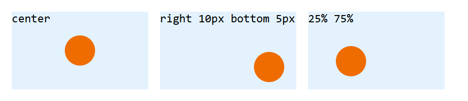
For photos cropped by object-fit: cover, object-position: 50% 20% keeps faces near the top in view.