An <image> fills background-image, border-image, mask-image, list-style-image or content. It can be a file, url("tile.png"), resolved relative to the stylesheet rather than the page; image-set("a.webp" 1x, "a-2x.webp" 2x), which lets the browser pick by pixel density (Baseline widely available since 2026); or a gradient painted at whatever size the box needs. Gradients come in linear-, radial- and conic- forms plus repeating- variants; two stops at one position make a hard edge, and in oklch avoids muddy sRGB midpoints.
<style>
  body { display: grid; grid-template-columns: repeat(3, 1fr); gap: 6px; margin: 6px; }
  div { height: 70px; padding: 4px; font: 12px monospace; color: #fff; text-shadow: 0 0 3px #000; }
</style>
<div style="background: linear-gradient(90deg, #1565c0, #ef6c00)">linear</div>
<div style="background: linear-gradient(90deg in oklch, #1565c0, #ef6c00)">linear in oklch</div>
<div style="background: linear-gradient(135deg, #2e7d32 50%, #fff3e0 50%)">hard stop</div>
<div style="background: radial-gradient(circle at 30% 40%, #fff3e0, #6a1b9a)">radial</div>
<div style="background: conic-gradient(#1565c0 0 40%, #ef6c00 0 70%, #2e7d32 0)">conic</div>
<div style="background: repeating-linear-gradient(45deg, #455 0 8px, #9ab 0 16px)">stripes</div>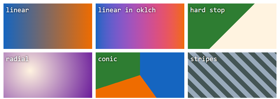
A gradient is an image, not a color: background-color cannot hold one, and a transition between two gradients does not animate unless you drive it with a registered custom property (Custom Properties). Gradients in Depth covers gradients in depth.