width and height take a length, a percentage of the containing block, or auto. A percentage height needs a parent with a definite height. min-width, max-width, min-height and max-height clamp the result, and the minimum wins a conflict. inline-size and block-size are the writing-mode-aware names (Direction and Writing Modes).
Three intrinsic keywords size a box from its content, all Baseline widely available: min-content is the narrowest width without overflow (the longest word), max-content is the width with no wrapping at all, and fit-content equals min(max-content, max(min-content, available space)). aspect-ratio: 16 / 9 (Baseline since 2021) derives the missing dimension when one of width or height is auto.
<style>
  body { font: 15px system-ui; margin: 8px; display: flex; gap: 110px; align-items: start; }
  section { width: 220px; flex: none; border: 1px dashed #90a4ae; }
  p { margin: 4px; padding: 2px 6px; background: #e3f2fd; }
  .video { width: 200px; aspect-ratio: 16 / 9; padding: 6px; background: #ef6c00; color: #fff; }
</style>
<section><p style="width: min-content">min-content wraps every word</p>
  <p style="width: max-content">max-content never wraps, even past its parent</p>
  <p style="width: fit-content">fit-content shrinks to fit</p></section>
<div class="video">aspect-ratio: 16 / 9</div>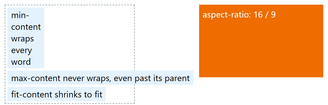
Practical rules: give fluid media max-width: 100%; height: auto, use min-height rather than height for panels that hold text, and keep the width and height attributes on <img> so the browser reserves the right aspect ratio before the file arrives, avoiding layout shift. aspect-ratio is ignored when both dimensions are set.