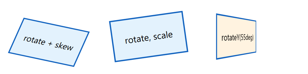
transform moves, turns, scales or skews an element's rendered box without affecting layout, so neighbors stay put. The functions translate(), rotate(), scale(), skew() and matrix() (with X, Y and 3D variants) pivot around transform-origin, and order matters: rotate(45deg) translate(100px) moves along the rotated axis. The individual properties translate, rotate and scale, widely available since 2025, apply in that fixed order before transform, so a hover rule can change scale alone. For 3D, give the parent perspective: 400px (smaller means stronger foreshortening), rotate children with rotateX(), rotateY() or translateZ(), add transform-style: preserve-3d for nested depth, and backface-visibility: hidden for flipping cards.
<style>
  body { font: 14px system-ui, sans-serif; margin: 30px 40px; display: flex; gap: 40px; }
  .box { width: 110px; height: 60px; display: grid; place-items: center;
         border: 2px solid #1565c0; background: #e3f2fd; }
  .a { transform: rotate(12deg) skewX(-12deg); transform-origin: left top; }
  .b { rotate: -8deg; scale: 1.1; }
  .stage { perspective: 250px; }
  .c { transform: rotateY(55deg); background: #fff3e0; }
</style>
<div class="box a">rotate + skew</div><div class="box b">rotate, scale</div>
<div class="stage"><div class="box c">rotateY(55deg)</div></div>