Motion path moves an element along a route. offset-path defines it: an SVG path() string, ray(45deg closest-side), a basic shape such as circle(40%), or url(#id). offset-distance (0% to 100%) places the element on it; animate it to produce movement. offset-rotate sets the heading: auto (the default) follows the path's direction, auto 90deg adds a correction, reverse faces backwards, and 0deg keeps it upright. offset-anchor picks the point that sits on the path.
<style>
  .stage { position: relative; margin: 14px; height: 120px; }
  svg { position: absolute; inset: 0; overflow: visible; }
  .arrow { position: absolute; top: 0; left: 0; width: 36px; height: 20px; background: #1565c0;
           clip-path: polygon(0 25%, 60% 25%, 60% 0, 100% 50%, 60% 100%, 60% 75%, 0 75%);
           offset-path: path("M 20 100 C 150 -30, 260 150, 400 50 S 560 10, 580 100");
           animation: fly 1s linear paused both; animation-delay: calc(var(--t) * -1s); }
  @keyframes fly { to { offset-distance: 100%; } }
</style>
<div class="stage">
  <svg><path d="M 20 100 C 150 -30, 260 150, 400 50 S 560 10, 580 100"
             fill="none" stroke="#90a4ae" stroke-width="2" stroke-dasharray="6 6"/></svg>
  <script>for (const t of [0, .2, .4, .6, .8, .999])
    document.write(`<i class="arrow" style="--t:${t}"></i>`);</script>
</div>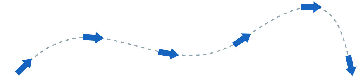
Motion path is widely available since 2025, though ray(), shapes and url() arrived later than path() (Chrome 116 1 , Firefox 122 555 ). path() coordinates are fixed pixels, so prefer circle() or inset() in responsive layouts. The offset is applied as a transform, so it animates cheaply.